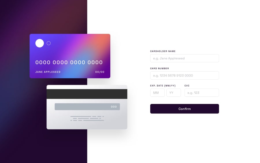
Design comparison
Solution retrospective
Your browser will warn you about safety XD, gotta find a way to avoid that later on
What challenges did you encounter, and how did you overcome them?Browser safety and positioning, did not overcome browser safety, positioning, mehh
What specific areas of your project would you like help with?browser safety shit
Community feedback
- @krushnasinnarkarPosted 4 months ago
Hi @Thirty-2,
Congratulations on successfully completing the challenge!
Your solution looks nice, though there are a couple of things you can improve, which I hope will be helpful:
-
Responsiveness: Your webpage is not responsive. You can make it responsive by using Tailwind's breakpoints like
sm,md,lg,xl, and2xlto redefine properties for specific screen sizes. This will ensure that your design adapts well across different devices. -
Tailwind Documentation: You can learn more about responsive designs using Tailwind at Tailwind CSS Documentation - Responsive Design. This will provide you with detailed guidance on how to implement responsive design effectively.
I hope you find this helpful.Feel free to reach out if you have more questions or need further assistance.
Happy coding!
Marked as helpful0 -
Please log in to post a comment
Log in with GitHubJoin our Discord community
Join thousands of Frontend Mentor community members taking the challenges, sharing resources, helping each other, and chatting about all things front-end!
Join our Discord
