Interactive Card Detail Component - REACT & TAILWIND CSS
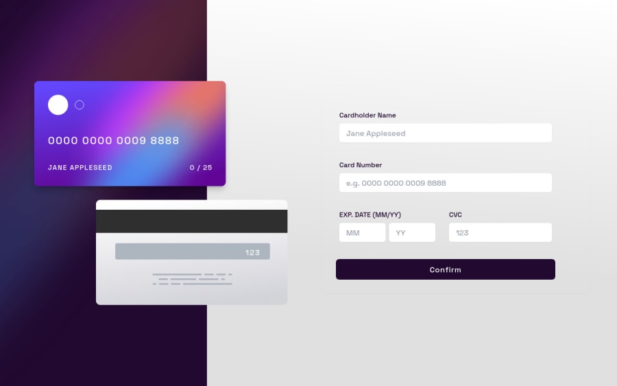
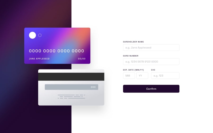
Design comparison
Solution retrospective
Hi Frontend Mentor Community, this is my solution for the Interactive Card Detail Component.
-
I saw this challenge a really long time ago, back when I was starting with CSS, and today I completed it using React.
-
I had fun making this one and also added some extra animations to it to make it more interesting.
Thank you, Feedback is welcome, Sameer
Community feedback
- @ApplePieGiraffePosted almost 2 years ago
Hi, Sameer Singh! 👋
Awesome job on this challenge! 👏 Your solution looks great and works well and I really like the animations you added to give your solution an extra touch! 👍
Only very small suggestion I have for you is to make sure the gradient background on the left side of the page in the desktop layout fills up the entire height of the screen (as it stops short on larger desktop screens). 🙂
Keep coding (and happy coding, too)! 😁
0@SameerJS6Posted almost 2 years ago@ApplePieGiraffe Thanks for pointing it out buddy, I kind of knew that but being lazy, I thought who's gonna use it on a big screen?
Nevertheless, I Fixed it....
Thank You...
1
Please log in to post a comment
Log in with GitHubJoin our Discord community
Join thousands of Frontend Mentor community members taking the challenges, sharing resources, helping each other, and chatting about all things front-end!
Join our Discord
