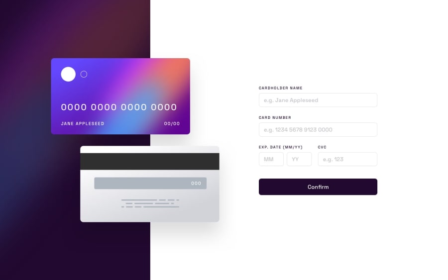
Design comparison
Solution retrospective
Some aspects of the client-side validation in the challenge did not make sense to me. For ex. for the card number I am only allowing numbers (no spaces) because it does not make sense to require the user to use spaces but then tell them in the error message that they can use only numbers. I am taking care of the number's formatting instead of the user because I know people can't really be trusted to follow instructions irl, lol. But I also think it is not the user's job to properly format. Also, the number is something that I would want to validate as the user is entering it before they are trying to submit. I am checking all of the input fields for entered value, not just the month, year and cvc fields like the challenge suggested. The design part was, again, the hardest and most annoying part for me in this challenge. While I thoroughly enjoy making things work, I quickly get frustrated with the css part. Many times css seems illogical and honestly, too much work for something as trivial as for ex. making a button look nice, ha. And it does not seem to get any easier as I build more and more. :-( I think I will start looking into css frameworks more.
Community feedback
Please log in to post a comment
Log in with GitHubJoin our Discord community
Join thousands of Frontend Mentor community members taking the challenges, sharing resources, helping each other, and chatting about all things front-end!
Join our Discord
