Not Found
Not Found
Not Found
Not Found
Not Found
Not Found
Not Found
Not Found
Not Found
Not Found
Not Found
Not Found
Not Found
Not Found
Not Found
Not Found
Not Found
Not Found
Not Found
Not Found

Submitted

interactive-card & added blur feature

@Yanivridel

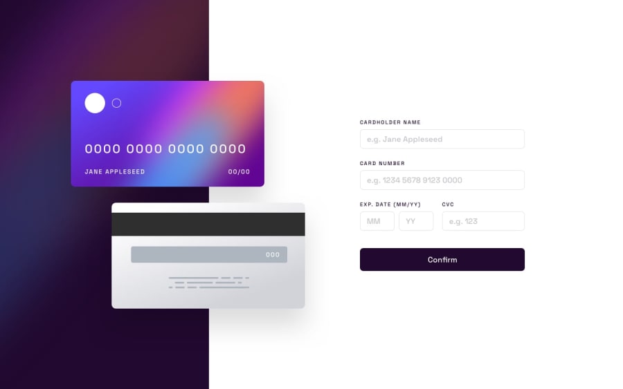
Desktop design screenshot for the Interactive card details form coding challenge

This is a solution for...

  • HTML
  • CSS
  • JS
2junior
View challenge

Design comparison


SolutionDesign

Community feedback

T
Grace 29,310

@grace-snow

Posted

I'm afraid this is missing some foundational code practices like:

  • using a form
  • programmatically linked error messages that are also announced to screen readers. Usually the error element is empty, has an aria-live and is linked to the input with aria-desciribedby.
  • autocomplete attributes with the correct values on inputs.
  • a fieldset and legend pattern for the group of fields for expiry date. You will need some visually-hidden (sr-only) labels on those inputs.
  • required attributes are missing.
  • using onclicks and oninputs is not a robust way to work. All this should have is a submit listener on the form that runs the validation. Alternatively or in addition you could have blur event listeners to run validation checks on specific fields.
  • img elements must always have alt attributes even if left blank for decorative images.
  • I'd expect an aria-live region wrapping the thank you content and I'd expect the visual cards display content to be aria-hidden.
0

T
Grace 29,310

@grace-snow

Posted

In the css

  • fonts via css imports are less performant than loading in the html head.
  • you should be using a full modern css reset at the start of the styles in every project.
  • setting the font size in px on the html element makes this immediately inaccessible. That means user text size settings will no longer be respected. It also changes what 1rem equates to which can cause huge maintenance issues in a project. Set font size on the body not html and always use rem for font size so it can scale as needed when desired by users.
  • removing outline from interactive elements like inputs also breaks accessibility requirements as it will no longer be possible for keyboard users to see where they are on a page. Changing a border colour is not enough for this as that relies on colour alone. There needs to be a visual difference in style or shape. Focus-visible styles are meant to be really obvious which is why outline is usually used.
  • buttons must not have explicit heights set, especially not in px. Use padding instead. Otherwise it can break when users change their text size.
0
T
Grace 29,310

@grace-snow

Posted

I've not got time to go through js as well but general tips

  • avoid changing inline styles with js. That's what css is for. Use js to toggle classes or change attribute values
  • ensure there is a form submit listener not button click.
  • try to simplify and reduce js as much as possible
  • read mdn tutorials on form validation. They are very good.
  • if changing error message text in js anyway it should be blank by default in the html.
0

Please log in to post a comment

Log in with GitHub
Discord logo

Join our Discord community

Join thousands of Frontend Mentor community members taking the challenges, sharing resources, helping each other, and chatting about all things front-end!

Join our Discord