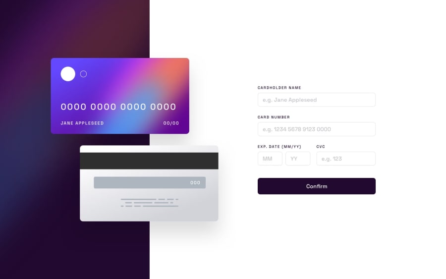
Design comparison
Solution retrospective
this took me a while ngl and the mobile view is not that good but I am learning a lot
Community feedback
- @jcboteroPosted 11 months ago
Hi Abraham-s-yakubu!. Nice code!. If you don't mind I would like to make a suggestion. I think you forgot to include a couple of things :
1.The credit card number field is not separating every 4 digits. To add space every 4 digits, in your javascript sheet you can add an eventlistener that takes the id of that input, and through the .replace() method, give an instruction to place a space every 4 digits. This way:
document.getElementById("cardnumber").addEventListener('input', function (e) { e.target.value = e.target.value.replace(/[^\dA-Z]/g, '').replace(/(.{4})/g, '$1 ').trim(); });
2.The image of the credit card is not reflecting the values entered in the fields. For this, you can use javascritp to send the value from one field to the other:
document.getElementById("inputFilled").innerText = document.getElementById("imgInput").value;
This within a function, or within an eventlistener.
If you think this helped you, please mark the comment as helpful. Thank you!
Marked as helpful0
Please log in to post a comment
Log in with GitHubJoin our Discord community
Join thousands of Frontend Mentor community members taking the challenges, sharing resources, helping each other, and chatting about all things front-end!
Join our Discord
