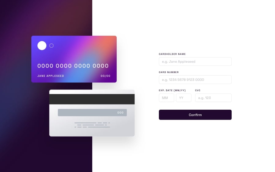
Design comparison
Solution retrospective
Hello, project works for destined window widths (375,1440) but going wild once it is resized to other values. Some advice on this would be very welcome ! Other things also ! Also what is wrong with those screenshots. It looks normally on screen yet here it looks terible.
Community feedback
- @J-HernandezMPosted over 1 year ago
maybe you should try to add a max-height to the top section and the images of the ccard try to make the position absolute relative to the top container instead of doing it in the body, if needed add a 3rd media querie for tablets.
Great job with the js, i solved it using other methods but i like some of your code. I'll implement myself on my code some of your ideas!
Marked as helpful0
Please log in to post a comment
Log in with GitHubJoin our Discord community
Join thousands of Frontend Mentor community members taking the challenges, sharing resources, helping each other, and chatting about all things front-end!
Join our Discord
