Design comparison
SolutionDesign
Solution retrospective
Hello everybody!
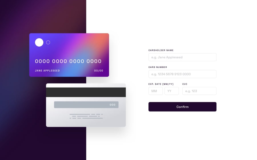
This challenge was pretty tough mainly because of interactive text over card image, after many hours of work i still have restrictive design with the minimal body width of about 600px, so may question to pro devs is how to deal with such components, my first thought is adding more break points for different sizes.
Community feedback
Please log in to post a comment
Log in with GitHubJoin our Discord community
Join thousands of Frontend Mentor community members taking the challenges, sharing resources, helping each other, and chatting about all things front-end!
Join our Discord
