Interactive and Responsive Article Preview Component


Design comparison

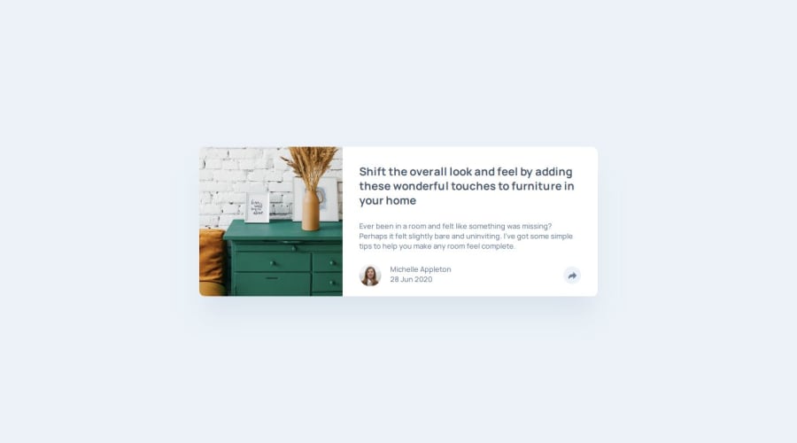
Solution retrospective
Honing my JS beginner skills. Maybe, optimize more my CSS in the future looking for better solutions.
What challenges did you encounter, and how did you overcome them?The mobile toggle state in comparison for tablet to desktop screen is a bit tricky. I have to make sure while the HTML is semantically correct, the styling needs to work regardless of the changes in positioning. I refactored several times but worth the trial and error. The thing that gave me hint on how to fix the problem is by grouping the button relative to the popover UI on active state while ensuring the footer that wraps it is working in place at the bottom of the article. Doing this allowed me to position the popover absolute to the share container that wraps both the button and the conditional popover. I was able to mimic the position by leveraging transform properties and transition.
Would love to see feedback generally on my solution, and on my added functionality on dismiss when I click outside of the popover.

Join our Discord community
Join thousands of Frontend Mentor community members taking the challenges, sharing resources, helping each other, and chatting about all things front-end!
Join our Discord