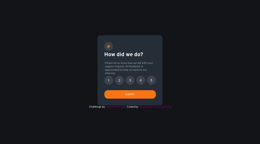
Interacitve Rating component with Flexbox and vanilla JS
Design comparison
Solution retrospective
What should I focus on learning or improving next? Do I look ready enough to advance to the junior challenges here at frontendmentor? Is some part of my css longer than it needs?(shortcuts or simpler way to do fix a problem)
Community feedback
- @TechNechPosted almost 3 years ago
Hey, hope you are doing good. I would like to suggest a few changes in your challenge:
-
In your
.cardclass, removeheightanddisplayproperties. -
In your
.rating aclass, removemax-widthand addwidth: 50px; height: 50px;, changeborder-radius: 50%;andpadding: 1rem;
Also I have noticed you are using
remandpxvalues mixed up which creates lot of issues. What I have learned is to useremvalues for things likepadding, margins etcandemvalues forfonts, which also helps in responsiveness.Hope I helped, Take care.
Marked as helpful0@purplehippo911Posted almost 3 years ago@TechNech Thanks for the feedback, it helped quite a lot.
0 -
Please log in to post a comment
Log in with GitHubJoin our Discord community
Join thousands of Frontend Mentor community members taking the challenges, sharing resources, helping each other, and chatting about all things front-end!
Join our Discord
