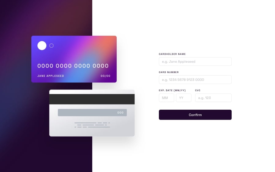
Interaactive Card Details Form - Framer-motion React Tailwind
Design comparison
Solution retrospective
This challenge proved to be more challenging than expected. Maintaining state
across components required for custom hooks and useContext.
I also sprinkled some Framer animations for UX/UI enhancements. The parallax effect for the card and the form validation, which hopefully will enhance the UX.
This challenge also showed the importance of a .fig file. I spent most of
the time pixel-pushing to set the dimensions, spacing, and layout right.
I am proud of the results since I was only eyeballing it.
The parallax effect on the card was a challenge and will need some improvement. I will revisit the code in my free time.
What specific areas of your project would you like help with?I am good. Enjoying these challenges.
Community feedback
Please log in to post a comment
Log in with GitHubJoin our Discord community
Join thousands of Frontend Mentor community members taking the challenges, sharing resources, helping each other, and chatting about all things front-end!
Join our Discord
