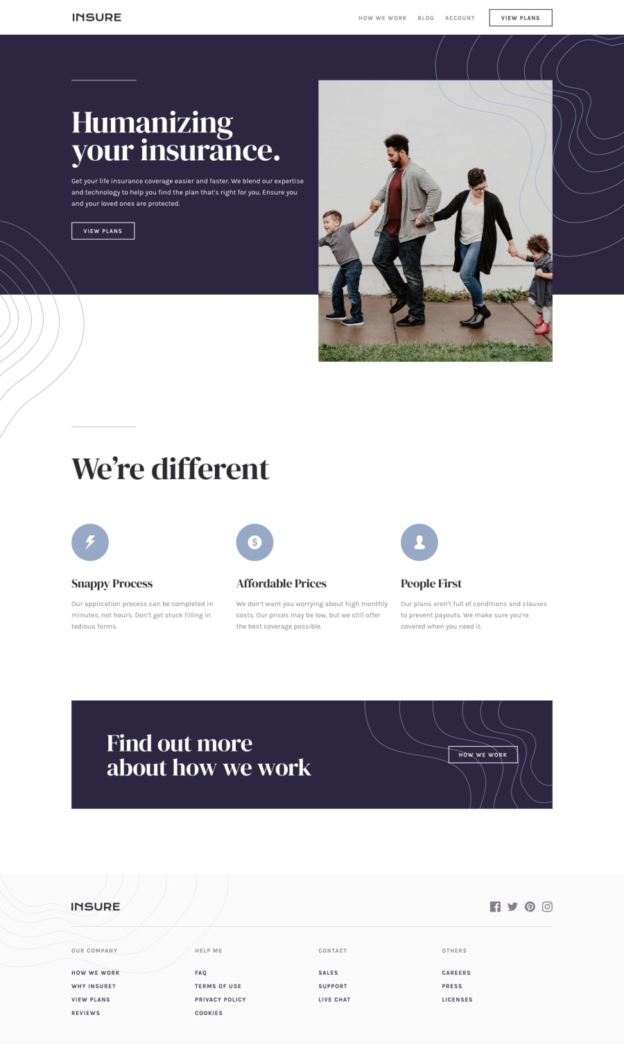
Design comparison
SolutionDesign
Solution retrospective
This is my next work, any feedback or tips would be appreciated.
Community feedback
- @iKINGDAVIDPosted about 3 years ago
Well done Coder. For your footer though, in terms of responsiveness, try to better demarcate each container when they stack ontop each other in mobile mode ( perhaps you should add margin bottom to each container in a media query or something or adjust the white space between contents of the list and their title)
Marked as helpful1
Please log in to post a comment
Log in with GitHubJoin our Discord community
Join thousands of Frontend Mentor community members taking the challenges, sharing resources, helping each other, and chatting about all things front-end!
Join our Discord
