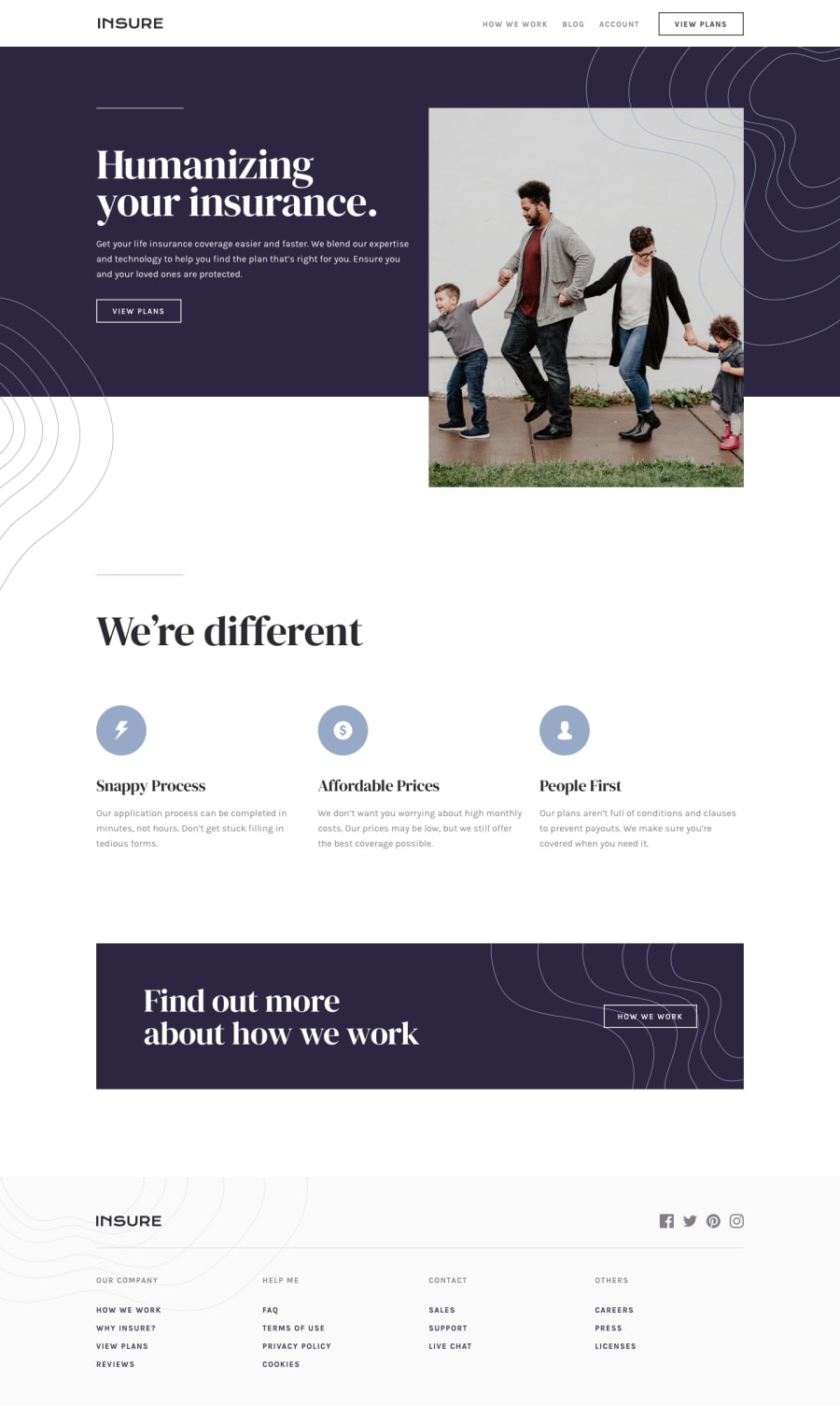
Design comparison
Solution retrospective
Hi, here is my solution to this challenge, The things learned doing this project:
1.That the behavior of z-index property is dependent on the positioning of the element and if specific styles such as trasnform are applied to the element.
2.How to use pictur tag to create responsive images.
3.Usage of object-fit property which is used to corp images.
4.A basic understanding of how and when to use css animation, For example I learned that css animation should be avoided on the mobile screen if possible because it hurts the performance of a site and uses a huge amount of bandwidth.
- How to write much more modular and organized styles using the @use, @forward and 7-1 architecture pattern.
6.How to write more accessible markup throught the usage of aria-label and aria-hidden attributes.
7.Creating accessible icons.
I would love to hear your thoughts,comments and qestions about any aspect of my solution.
Happy coding :)
Community feedback
Please log in to post a comment
Log in with GitHubJoin our Discord community
Join thousands of Frontend Mentor community members taking the challenges, sharing resources, helping each other, and chatting about all things front-end!
Join our Discord
