Insure-landing-page using HTML,CSS and JAVASCRIPT
Design comparison
Solution retrospective
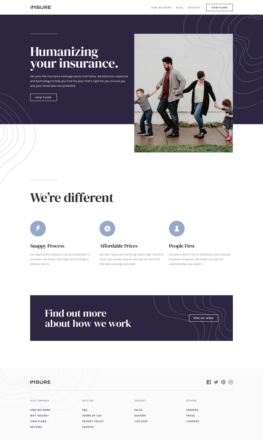
I have faced some problems in positioning the image in first section...I have tried to position the image by adding the property [ position : absolute ] to position it outside the div...but I couldn't position it in responsive mobile view...so I change the design a little bit and put the image inside the div....so please tell me how to solve my image problem...and if I had made any mistakes in this challenge , feel free to point it out.
Community feedback
- @DanRHatfieldPosted over 2 years ago
Hi Taskin,
First off, congrats on finishing the project!
I had a similar issue when I was doing this one. I found the answer through making using a linear-gradient that was set on the background with the darker portion going a certain percentage and then white after. It gave the effect of looking like the image was hanging outside the section, but in reality the section was two tone in color and it was part of both.
This is the page that gave me the idea: https://developer.mozilla.org/en-US/docs/Web/CSS/gradient/linear-gradient
Marked as helpful0@TaskinSultanaPosted over 2 years ago@DanRHatfield Thank You so much....You just solved my problem
0
Please log in to post a comment
Log in with GitHubJoin our Discord community
Join thousands of Frontend Mentor community members taking the challenges, sharing resources, helping each other, and chatting about all things front-end!
Join our Discord
