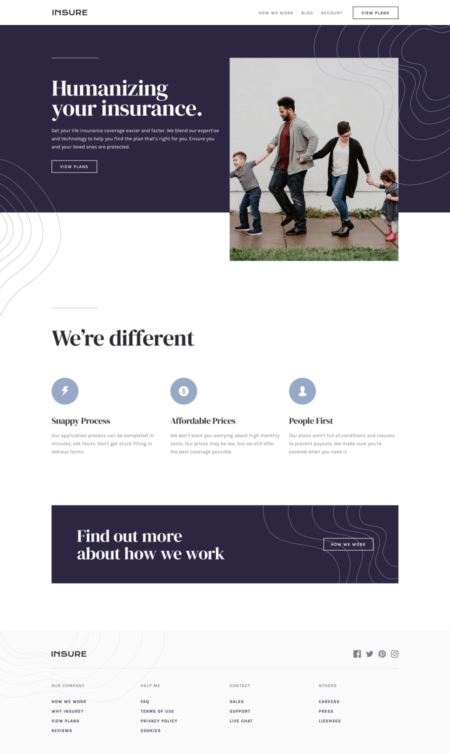
Design comparison
SolutionDesign
Solution retrospective
Any feddbacks are welcome.Thanks.
Community feedback
- @pikapikamartPosted over 3 years ago
Hey, great work on this one. Resizes well and looks good both in desktop and in mobile.
Suggestion/s would be that
-
The social media links is supposed to be a link right. Now it is declared only as an svg inside on a div. It will be better in terms of markup that it is inside of
atag. -
The footer text links. They are supposed to be using
atag as well since they are links.
But still, you did a great job in here^^
0@dinaPutrimpPosted over 3 years ago@pikamart Thank you for your feedback. I will correct it.
0 -
Please log in to post a comment
Log in with GitHubJoin our Discord community
Join thousands of Frontend Mentor community members taking the challenges, sharing resources, helping each other, and chatting about all things front-end!
Join our Discord
