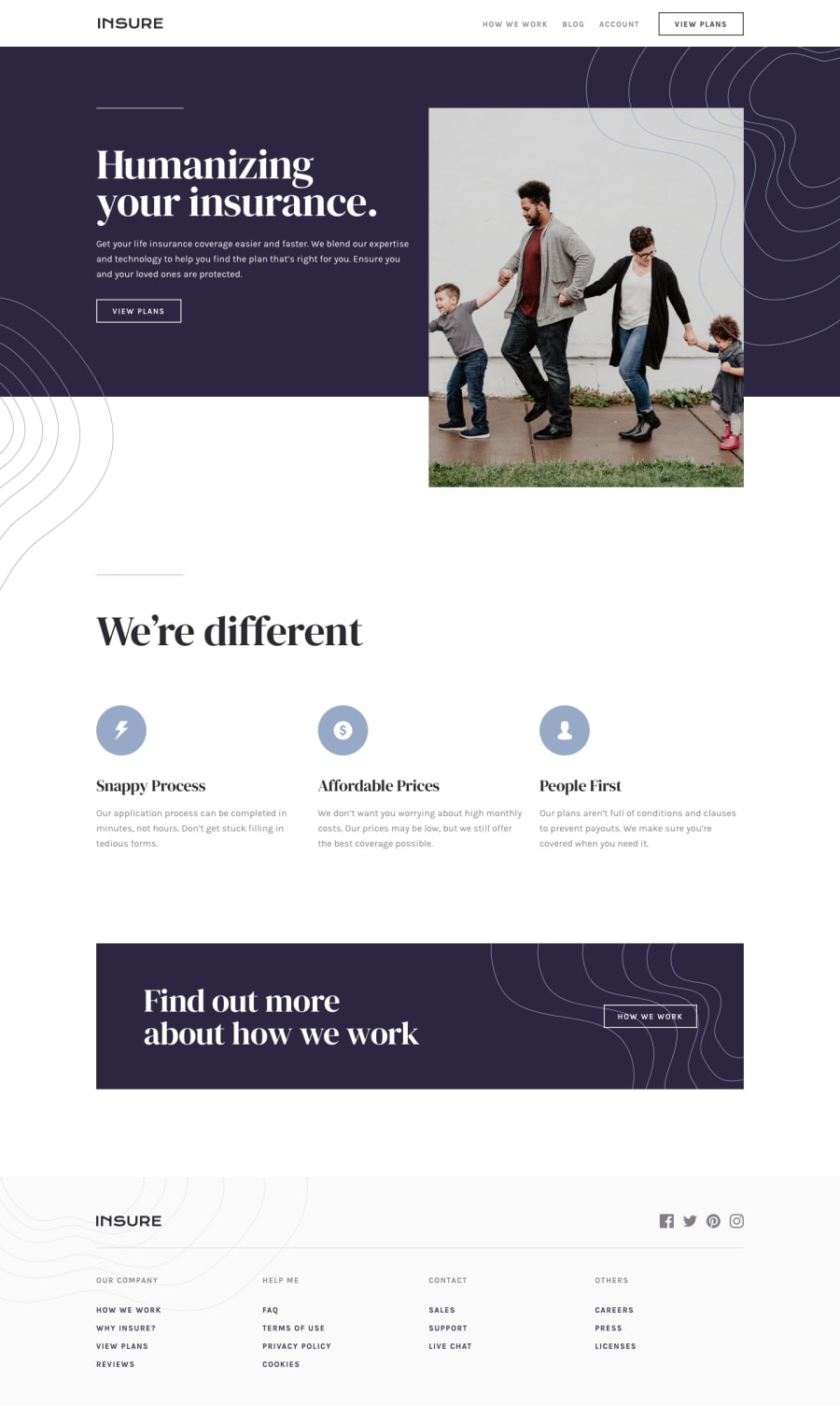
Design comparison
Solution retrospective
This challenge was a real fun to me but I'm facing some issues here. Anyone's help is appreciated
-
as you see the page in in mobile view and when you click on hamburger menu the page is still getting scrolled I want that whoever taps the menu the page gets fixed until and unless the menu gets closed.
-
the second issue I'm getting when you check the website in chrome developer tools make the screen size around 550 px and then click the hamburger menu and then try to resize it again the menu is still there.
Thank You
Community feedback
- @dwhensonPosted over 3 years ago
Hi @Rishabh-Pagaria nice work on this one! 🙌 I just had a quick look at your site and I think in general it looks good. In response to your questions:
-
I think what you have works well. I personally think it is ok for the user to be able to scroll the page when the menu is open as it avoid the risk of trapping them there. Some things to consider to make this work nicely are: close the menu if the user clicks or focuses outside it; and change the hamburger icon to an X when the menu is open to show the user where they can close the menu.
-
On point two, that's tricky! I imagine that you are hiding and showing the hamburger button with a media query, but using JS to show/hide the hamburger menu and that these two things are aligned.
Hamburger menus are very tricky to get right, I bought a tutorial from Andy Bell's site for about $5 which is very in depth, and spent quite a bit of time going through it. It's a pattern that comes up again and again, so for me this was worth the investment and has helped with a lot of challenges.
Some other points you might like to consider (I'm mainly focusing on the HTML here) are:
-
On the design, there is a lot of spacing between the sections and you probably want to reduce this a little as it doesn't feel right at the moment.
-
Rather than using a
divto open the hamburger menu I would suggest abuttonas it is an interactive element. -
Similarly in the footer I would use a
navelement for the list of links as you can have more than one per page no problem. -
In the top
navtheliitems should contain a link, as this will make them tab-able - I was a bit confused as I was being sent to the bottom of the page when I tried this ) -
In general I would suggest using
text-transform: uppercaserather than writing in capital letters as if the design changed later it would make changing things much easier. -
Last but not least! Please remember that you should only have one
h1per page and that the header order should follow down the list without skipping any levels. E.g. you shouldn't have ah3after ah1without ah2in between.
At the moment you seem to be using the heading levels to visually indicate the document hierarchy? E.g. the
h4andh3elements you have used for the elements that have the appearance of buttons. These should just be standard links and not headers.This last point is really important. I have found that a well structured HTML document is a really important foundation for writing code efficiently and avoiding problems later on. Personally I do all the HTML first and don't worry about the styles until later.
I hope this helps and keep up the great work!! 👍 Please let me know if anything is not clear. Cheers 👋
1 -
Please log in to post a comment
Log in with GitHubJoin our Discord community
Join thousands of Frontend Mentor community members taking the challenges, sharing resources, helping each other, and chatting about all things front-end!
Join our Discord
