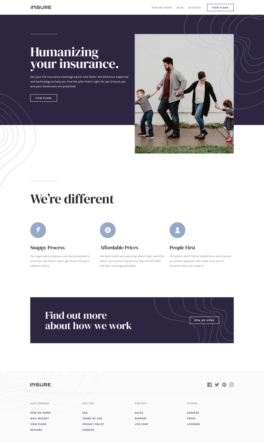
Design comparison
Solution retrospective
Give ffedback pls, thanks.
Community feedback
- @havickyPosted about 4 years ago
This is beautiful! I love the design and color palette. One observation: the font color or the wave design might be difficult for some people to see since the color is lighter. There are some great resources put there to check contrast colors and see if they meet accessibility standards. Other wise, it looks amazing!
0@IykekelvinsPosted about 4 years ago@havicky thank you for your feedback, I'd look into it.
0 - @artimysPosted about 4 years ago
Really nice work Kelvin 👍👍 especially with the animations. I love the animation on the intro section especially when resizing the browser
Just a few observations. In the mobile menu when hovering over the text it blends in with the background. When the mobile menu is open. It's possible to scroll down and see the remaining page design.
Just my opinion for the animations after the intro section,
section.about-company. To have it only run once when scrolling down. If I scroll back up and back down the content should remain static after.Great job and keep on coding 👍
0@IykekelvinsPosted about 4 years ago@artimys thanks a lot for your feedback. I tried giving the menu a 100vh, I noticed it didn't cover all part of the screen. I'd look for a way to solve it, and also I'd look into the animations again. Thanks a lot.
0
Please log in to post a comment
Log in with GitHubJoin our Discord community
Join thousands of Frontend Mentor community members taking the challenges, sharing resources, helping each other, and chatting about all things front-end!
Join our Discord
