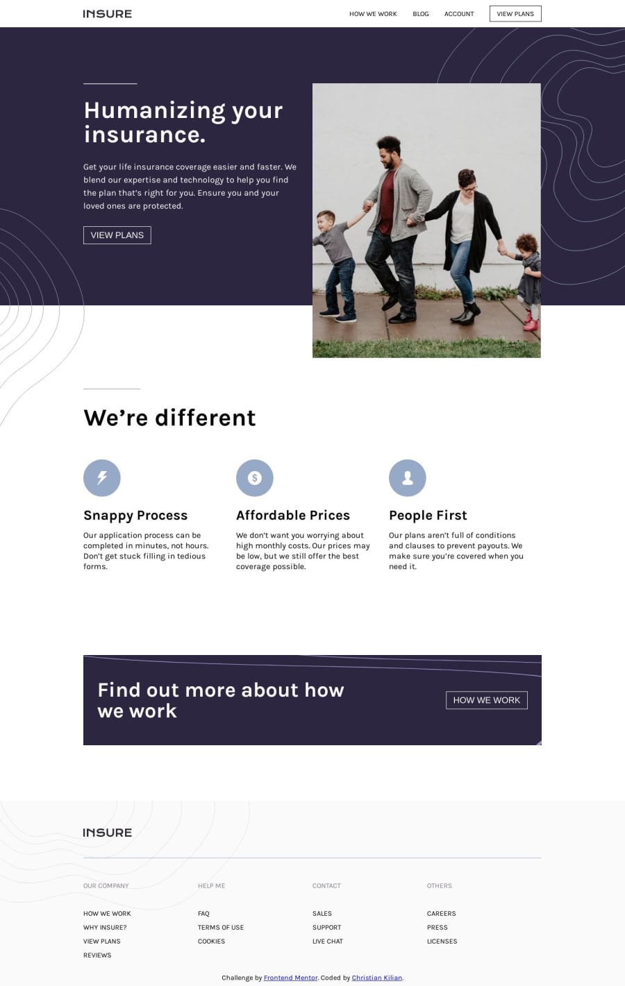
Insure Page with Plain CSS, HTML, and Navbar in JS
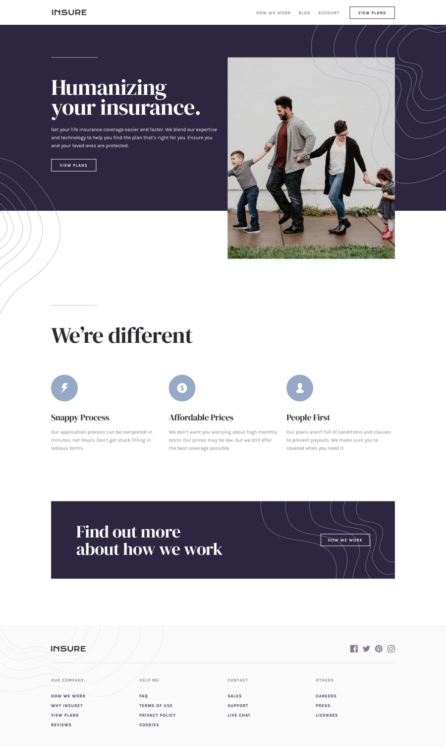
Design comparison
Solution retrospective
How can I improve the mobile popup nav?
Community feedback
- @stevenCsaundersPosted almost 5 years ago
@walrusprince16 Great job on the solution!
To ease into the active state you can add a CSS transition on the opacity property on your container for the mobile nav.
One other thing to think about is sticking to only classes for CSS selectors. Use IDs if necessary for Javascript. IDs add unnecessary specificity to the HTML/CSS and cannot be reused. Classes can be used multiple times and in case you need additional specificity in your CSS you can add more than one class to an element.
1@WalrusPrince16Posted almost 5 years ago@stevenCsaunders thanks for the tip on IDs. I tend to overuse them a lot, I'll try to cut down on them in the future
0
Please log in to post a comment
Log in with GitHubJoin our Discord community
Join thousands of Frontend Mentor community members taking the challenges, sharing resources, helping each other, and chatting about all things front-end!
Join our Discord
