Design comparison
SolutionDesign
Solution retrospective
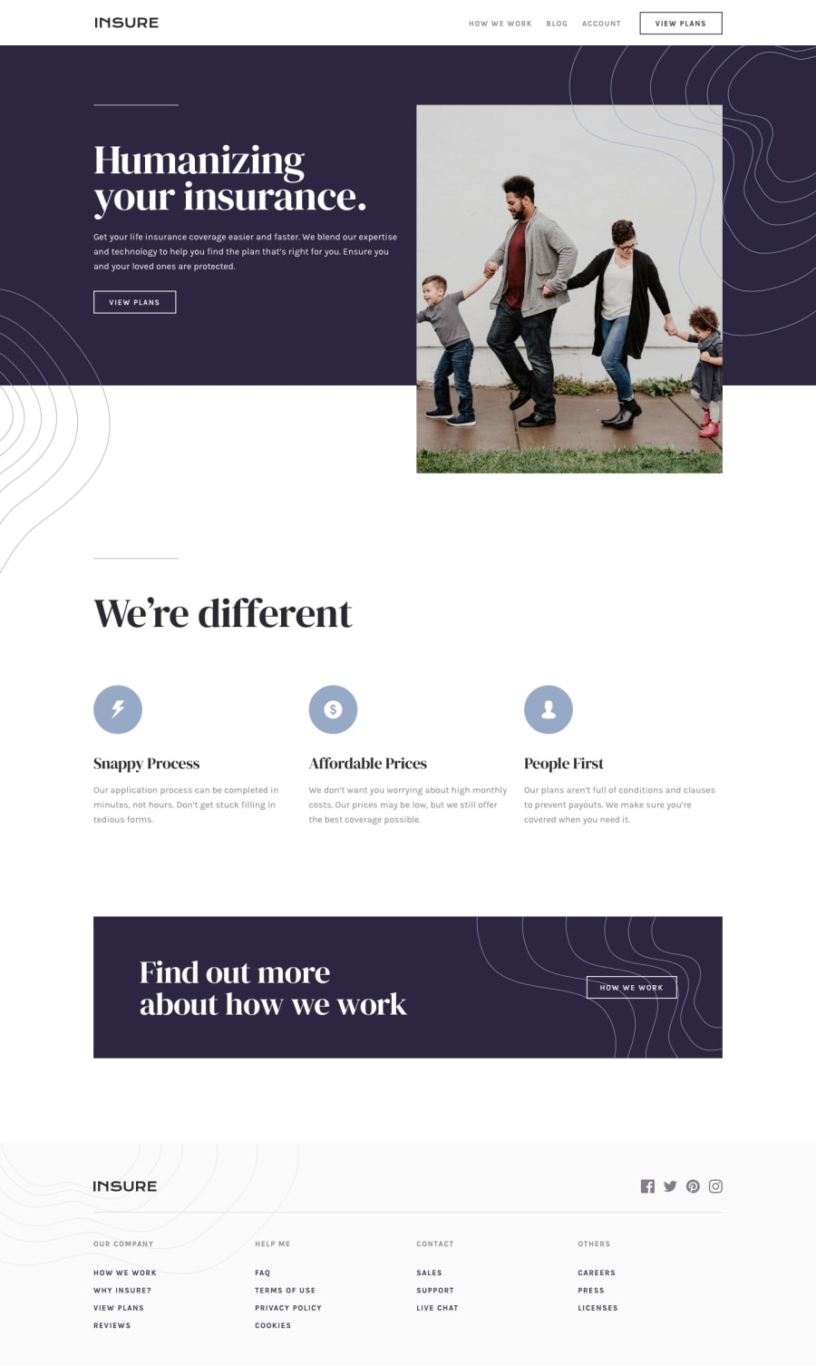
Despite using the exact fronts, weights and sizes defined in the style guide I feel like the fonts still aren't quite matching. CSS also got a bit messy on this one, some more forethought on how the HTML should be structured would be great in future.
Community feedback
Please log in to post a comment
Log in with GitHubJoin our Discord community
Join thousands of Frontend Mentor community members taking the challenges, sharing resources, helping each other, and chatting about all things front-end!
Join our Discord
