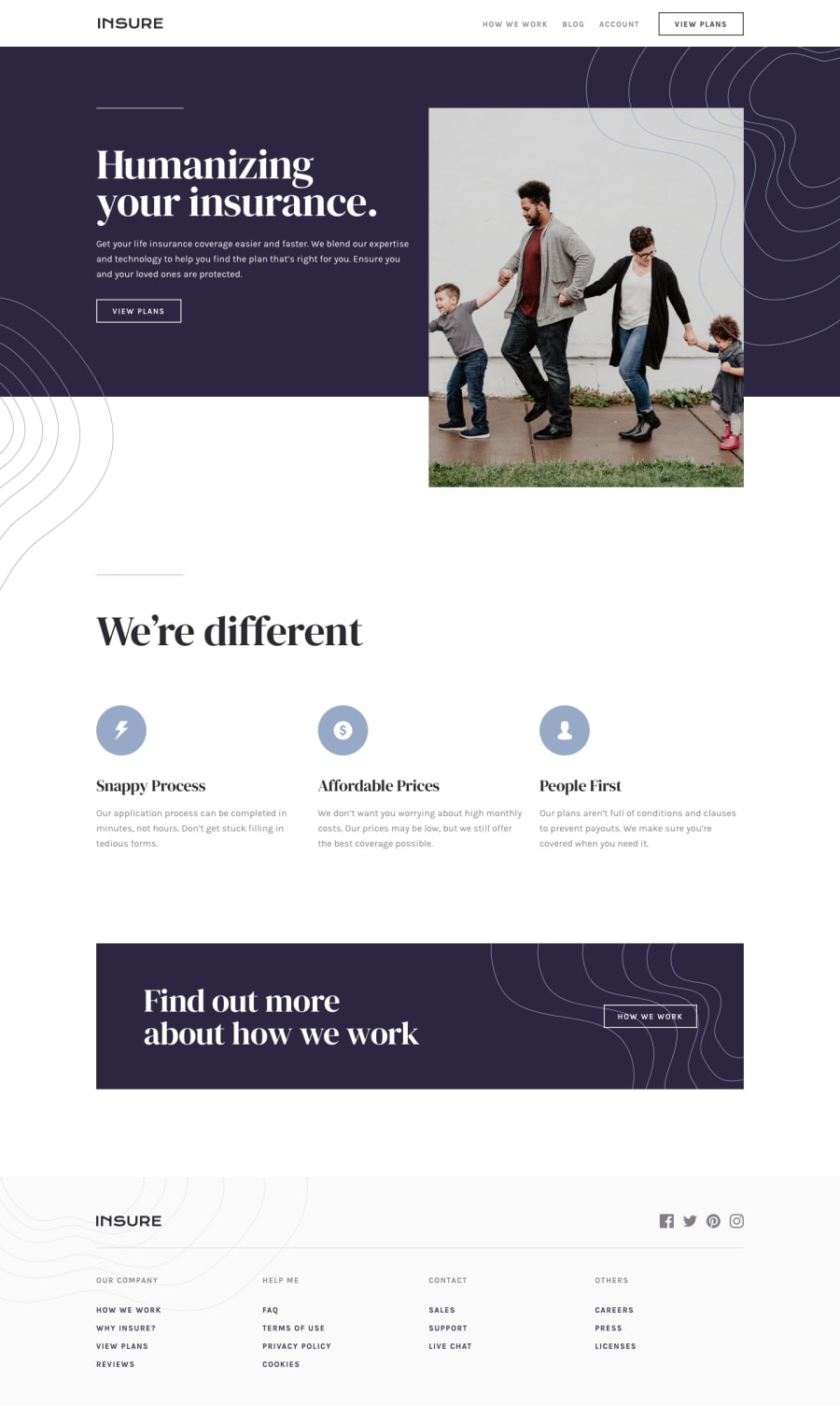
Design comparison
SolutionDesign
Solution retrospective
Please leave a comment about what I should improve! tks
Community feedback
- @FrontmaniaacPosted over 3 years ago
Hello there! Only constructive critisizm here.
- On small devices the padding is too big making everything go into one worded columns on the "We're different" section.
- Around 830px width the font size is so small you can barely read it
- The footer and header font, is too small on all mobile devices.
- I would add
transitionfor all the button hover effects. It's a small detail but makes a quite difference. - There is no X button where opening the navbar. Despite from that, overall you did a good job! Keep up the good work and happy coding
0@HudsonhfreitasPosted over 3 years ago@Frontmaniaac Thank you so much for your feedback, I've already done some changes !
1
Please log in to post a comment
Log in with GitHubJoin our Discord community
Join thousands of Frontend Mentor community members taking the challenges, sharing resources, helping each other, and chatting about all things front-end!
Join our Discord
