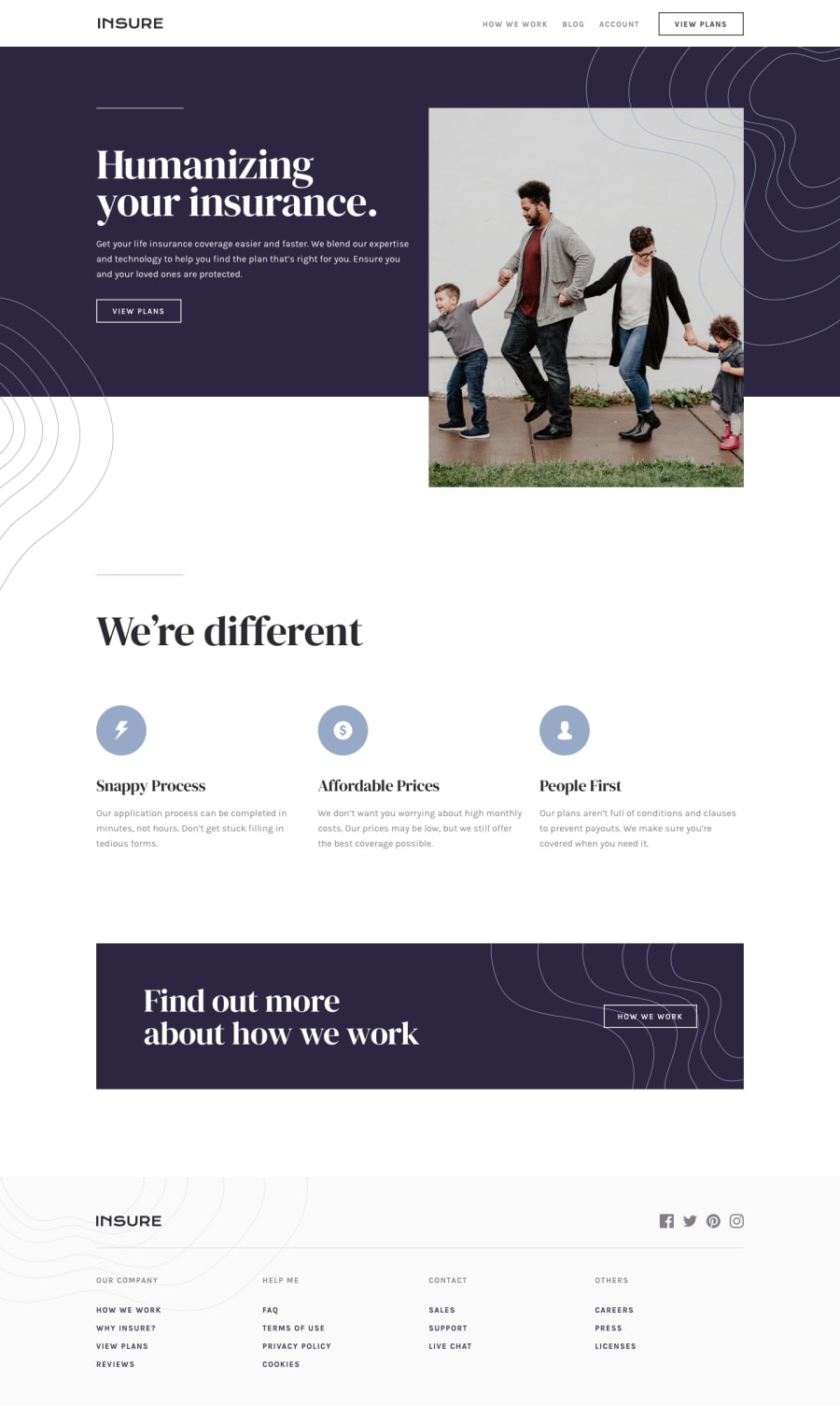
Design comparison
Solution retrospective
I used mobile-first which works well I think but the main issue I've had with desktop versions is the different patterns and how to position them? I used background images on mobile, however in desktop view should I perhaps use absolute positioning instead?
Community feedback
- @isimeriPosted almost 4 years ago
Hello there. You are right, in some cases you can use those wavy patterns as
background-imageand forget about them, but in the case of the pattern that goes over the blue and the white background, you'd probably want to use absolute positioning. There is another interesting issue i found. By default, yournavhas the.show-hideclass, and if you reduce the width of your screen, to reach the mobile layout and press the hamburger button to close thenavmenu, then increase the screen width to go back to the desktop layout, there is nonavmenu and no button to make it appear. I'd actually create anothernavmenu, specifically designed for the mobile layout and just keep itdisplay: nonein the desktop layout, so there won't be any worries regarding thenavbeing there when switching between the mobile/desktop layouts. Also, your links and buttons don't have any hover states and the top logo looks a little distorted in the mobile layout, but those are minor issues. You have done a majestic job, mostly. Keep it up!Marked as helpful0
Please log in to post a comment
Log in with GitHubJoin our Discord community
Join thousands of Frontend Mentor community members taking the challenges, sharing resources, helping each other, and chatting about all things front-end!
Join our Discord
