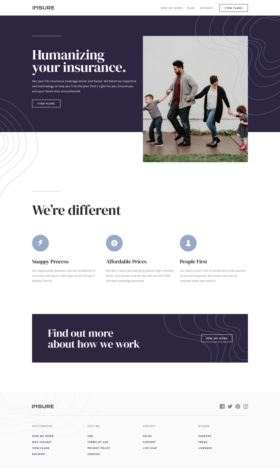
Insure landing page with - Vanilla JS, HTML and CSS
Design comparison
Solution retrospective
I've had to use two empty divs to display the curly background patterns in the intro section. I feel this approach is not effective. Any ideas on a better way to achieve the design that's in line with best design practices? You're welcome.
Community feedback
- @krebeDevPosted almost 5 years ago
Thanks for the feedback @mattstuddert. I didn't know I could use
url()ascontentfor::beforeand::afterpseudo-elements until today. I'll definitely give it a try.0@mattstuddertPosted almost 5 years ago@krebeDev yeah you can use both of them as regular elements, which is perfect for decorative details like this.
0 - @mattstuddertPosted almost 5 years ago
Your solution looks really good, Solomon. Nice work! To answer your question about the
divelements, there are two possible solutions:- Instead of empty
divelements in your HTML you could use pseudo-elements, like::beforeand::afterto add those patterns. This would mean you don't have extra elements in your HTML. - Another approach would be to add multiple
background-images to the introductory section.
Let me know if you have any questions. Keep up the great work!
0 - Instead of empty
Please log in to post a comment
Log in with GitHubJoin our Discord community
Join thousands of Frontend Mentor community members taking the challenges, sharing resources, helping each other, and chatting about all things front-end!
Join our Discord
