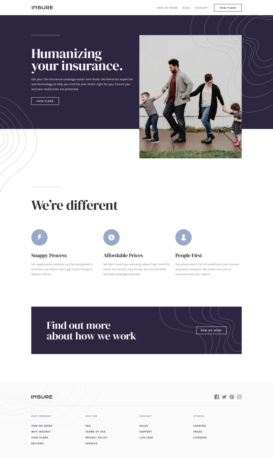
Design comparison
Solution retrospective
Hi there! Share your suggestions on how to lock body from scroll while burger menu is open. I used the one which does not work on iOS. Thanks! Happy coding everyone! =)
Community feedback
- @AngelGris76Posted about 3 years ago
Hi @marvelousveronika.
I just add a class to the body when button is "pressed". That class only contain one rule.... "overflow: hidden".
0 - @pikapikamartPosted about 3 years ago
Hey, awesome work on this one. Layout in desktop looks great though you are missing the 3rd icon after the hero-section. The responsiveness is fine and the mobile layout, text are really big you might need to tone it down.
Some other suggestions would be:
- I wouldn't nest the website-logo inside the
navsince it is not being treated as a link. - Website-logo
imgshould be using the website's name as thealtlikealt="insure". Remember that a website's logo is meaningful so always make sure it uses the properaltvalue. - Also when using
altattribute, avoid using words that relates to "graphic" such as "logo" and others. Animgis already an image/graphic so no need to describe it as one. - Also looking at it, you don't need to create a separate navlinks for the mobile state, it would be better to reuse the primary navlinks so that your markup will be more cleaner.
- Hero-image could use a more descriptive
alttext rather than justalt="family". - Avoid using multiple
h1on a page, use only at least 1 per page so change those into other heading tags. - Each icon are just decorative so better hide it. Decorative image must be hidden at all times by using
alt=""and extraaria-hidden="true"attribute on theimgtag. - When using heading tag, make sure you aren't skipping a level. If you use
h3make sure thath1, h2are present "before" it.
FOOTER
- The
navshould be wrapping the 4 list of links below and not the website-logo with the social media since those aren't your navigational links. - Same for logo, use proper
altlike what I mentioned above. - Each
atag that wraps social media, it should have eitheraria-labelattribute or screen-reader element inside it. The value for whatever method you will use should be the name of the social media likearia-label="facebook"on the facebook linkatag. This way, users will know where this link would take them.
MOBILE
- Hamburger menu should be using a
buttonelement since it is a control. Interactive components uses interactive elements. By usingdivyou are making it not-accessible.
SUPPOSING BUTTON IS USED
- The
buttonwill be using the method I mentioned usingaria-labelattribute or screen-reader element inside. The value will describe what does thebuttondo. The value could bearia-label="navigational dropdown menu". - The
buttonshould have a defaultaria-expanded="false"attribute on it. It will be set totrueif the user toggles thebuttonand vice-versa. You will need to use.setAttributemethod.
Aside from those, great work again on this one.
0 - I wouldn't nest the website-logo inside the
Please log in to post a comment
Log in with GitHubJoin our Discord community
Join thousands of Frontend Mentor community members taking the challenges, sharing resources, helping each other, and chatting about all things front-end!
Join our Discord
