Design comparison
SolutionDesign
Solution retrospective
Feedback would be appreciated ☺️
Community feedback
- @ApplePieGiraffePosted over 2 years ago
Hey, Headbwoi! 👋
Good job on this challenge! 👏
A couple of things I'd like to suggest are,
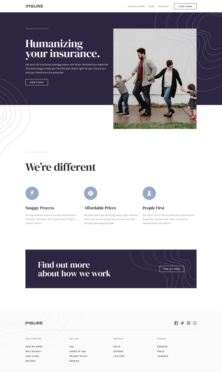
- Turning the social media links in the footer of the page into actual links by wrapping each of them in a link tag. You may also want to add some screen reader-only text inside those links or add an `aria-label` attribute to them instead to make sure they can be identified by screen readers.
- Setting the `alt` text for the icons in the page to an empty string so that they will be ignored by assistive technologies (since they aren't very important to the content of the page and as a result don't need to be read by screen readers).
- Adding
object-fit: coverto the image in the hero section of the page to ensure that it isn't squeezed or stretched when there isn't enough space for it to be displayed at its original aspect ratio. - Also maybe centering that hero image or making sure that it fills up the entire width of the screen (as in the original design) in the mobile view of the page.
Hope you find these tips helpful. 😊
Keep coding (and happy coding, too)! 😁
Marked as helpful2
Please log in to post a comment
Log in with GitHubJoin our Discord community
Join thousands of Frontend Mentor community members taking the challenges, sharing resources, helping each other, and chatting about all things front-end!
Join our Discord
