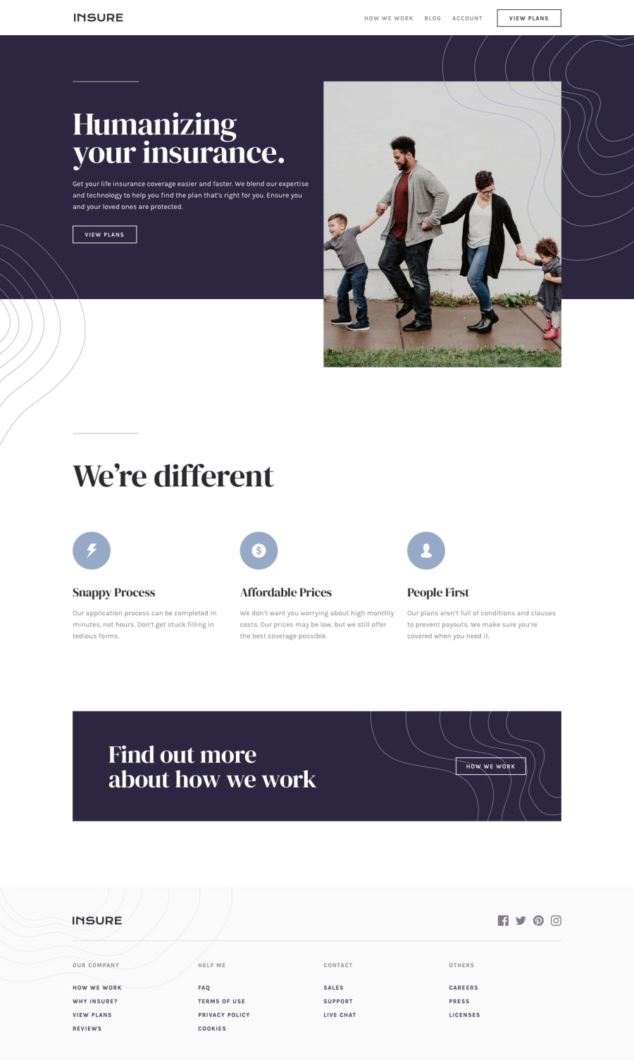
Design comparison
Solution retrospective
A feedback would be appreciated.
Community feedback
- @AgataLiberskaPosted over 3 years ago
Hi @Gesiere! Well done on this challenge, it looks great! Here are some things you could do to improve it further:
-
Have a look at how the page is displayed at 1024px - the content stretches from edge to edge of the viewport, it could use some margin/padding at that width.
-
You could add a transition to your hover styles to make it look more polished
-
I'm not sure about using alt text on the hamburger icon in terms of accessibility - I would personally use
aria-labelandaria-expandedthere, it could be something to look into further.
Hope this helps :)
1@GesierePosted over 3 years ago@AgataLiberska Thank you on your feedback, will look at what you said and sort it out.
0 -
Please log in to post a comment
Log in with GitHubJoin our Discord community
Join thousands of Frontend Mentor community members taking the challenges, sharing resources, helping each other, and chatting about all things front-end!
Join our Discord
