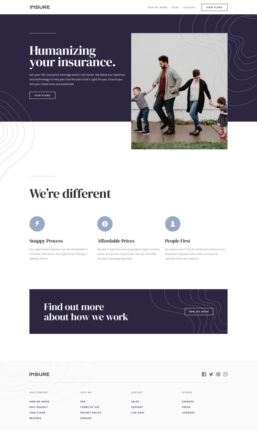
Design comparison
Solution retrospective
As always any feedback would be much appreciated! Thank you!
Community feedback
- @ApplePieGiraffePosted almost 4 years ago
Hey, Sandro! 👋
Great job on this challenge! 👍 Everything looks good and responds nicely! 👏
The only very small thing I might suggest is to add the background image to the mobile navigation from the original design (I believe there should be some wavy lines against the dark brown background or something). 😉
Keep coding (and happy coding, too)! 😁
1@SanidethPosted almost 4 years ago@ApplePieGiraffe Hey ApplePie, thanks again for your feedback.
Ups I didn't notice that, I'll fix it shortly! :D
0 - @Nard00Posted almost 4 years ago
Perfect!!! I wish I was on your level.
1@SanidethPosted almost 4 years ago@Nard00 Hey! Thank you for your feedback!
Don't worry, you'll get there soon, keep coding!
0
Please log in to post a comment
Log in with GitHubJoin our Discord community
Join thousands of Frontend Mentor community members taking the challenges, sharing resources, helping each other, and chatting about all things front-end!
Join our Discord
