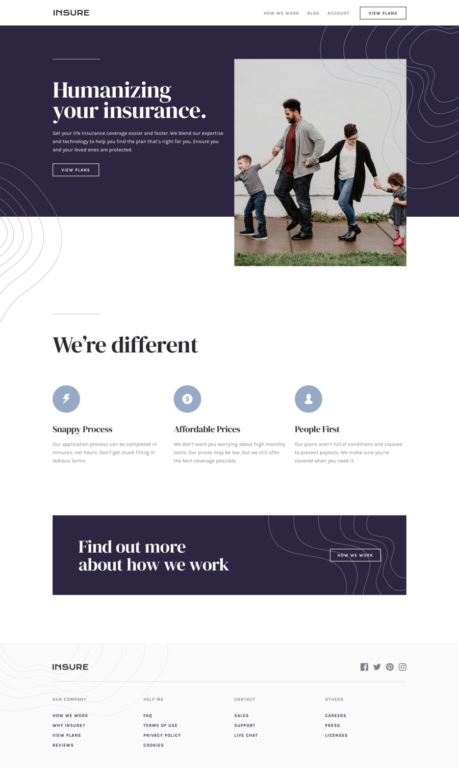
Design comparison
SolutionDesign
Solution retrospective
At first, it was difficult to position the background images but I was later able to do it. Though my solution worked, I want to know if you have any better way of doing this.
Community feedback
- @Wr3nDPosted about 2 years ago
Hey ! good job on finishing this one , it looks like you chosed not the right resolution bcouse the screenshot is not fitting in.
design problems on first sight :
- wrong usage of cursor pointer ( you are missing it on important parts of the web like VIEW plans and how we work buttons) and in the footer you have it all over the place instead just on elements itself
- white space , font-sizes all over the place are not fitting to the preview ones also in fist sight it feels that it should be different size ( some pieces are too big and with the rest it doesnt feel right )
- missing pieces ( simple <hr/> line ) in the top over humanazing
0
Please log in to post a comment
Log in with GitHubJoin our Discord community
Join thousands of Frontend Mentor community members taking the challenges, sharing resources, helping each other, and chatting about all things front-end!
Join our Discord
