


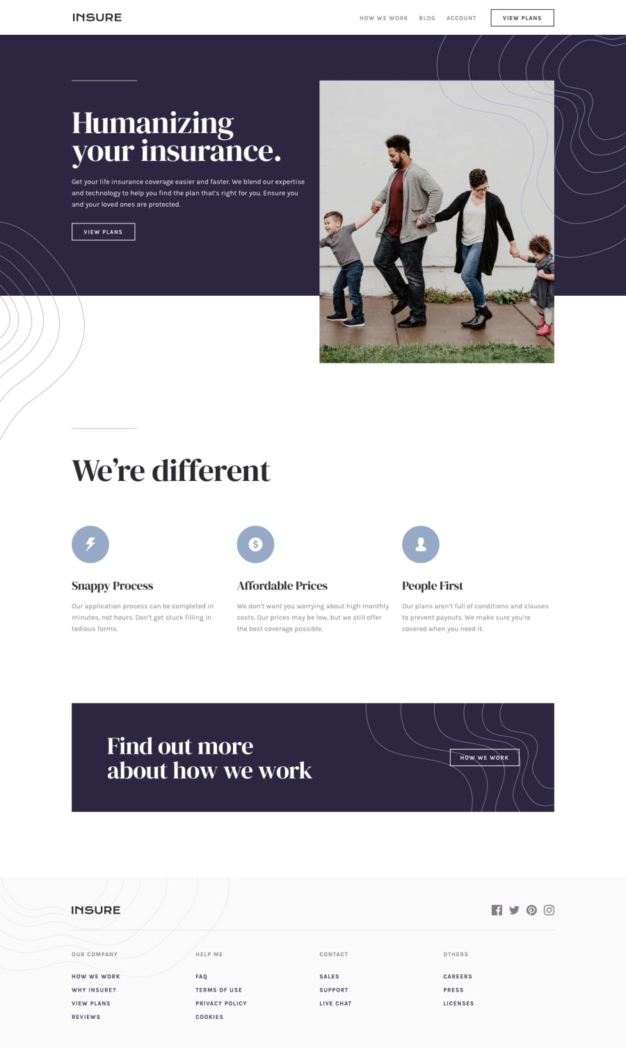
Design comparison
Solution retrospective
helpful feedbacks would be appreciated
Community feedback
- @AgataLiberskaPosted over 2 years ago
Hi! Nice work on this solution, visually I think this looks really nice. I would just work on the html - for a simple page like this, you're using quite a lot of nested divs which I personally think are unnecessary here, a lot of those could just be removed with no effect on the page. If you have a few block elements you don't really need to wrap them in a div unless you're grouping them for styling purposes etc. :)
Nice work using a list for the social icons in the footer (those will need some labels/titles to validate though) but I think the three divs in 'we're different' section also should be an unordered list. And the mobile menu toggle should definitely be a button :)
Hope this helps !
Marked as helpful0@iyke-ePosted over 2 years ago@AgataLiberska
thanks alot this was really helpful.
0

Please log in to post a comment
Log in with GitHubJoin our Discord community
Join thousands of Frontend Mentor community members taking the challenges, sharing resources, helping each other, and chatting about all things front-end!
Join our Discord