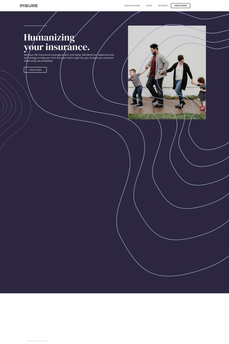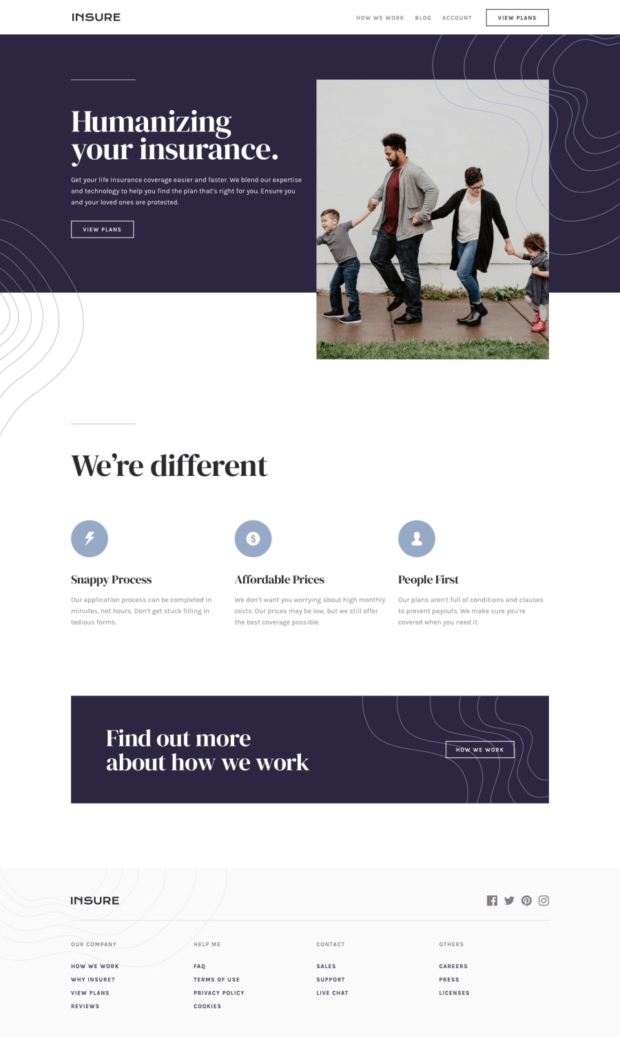
Design comparison
Solution retrospective
I could not do the active state design for the buttons (except the one in the header). They don't change on hovering the mouse. How could it be done? Thank you
Community feedback
- @adarshcodesPosted over 4 years ago
Hi! @PJ Mantoss, try the solution as told by @MSultan9, it'll work and also the responsiveness you can add some breakpoint at 1050 and few less than as required for good responsiveness, nice work👍.
1@PJMantossPosted over 4 years ago@adarshcodes I tried the solution by MSultan9 and it worked. Thank you. For the responsiveness,I really don't know how to apply two different break points at once (in the same css). Can it be done? I only adjusted the previous breakpoint '@media(max-width: 770px){}' to '@media(max-width: 1050px){}'. Thank you
1@adarshcodesPosted over 4 years ago@PJMantoss I was saying that you can add 4-5 breakpoints for the good responsiveness, and I don't think we can add two breakpoints simultaneously. I saw your update and it now responsiveness works fine🙂, but there are few layout problems which I know you'll fix from your next project, great work👍.
0 - @MSultan9Posted over 4 years ago
You added z-index: -1 on the intro div which pushed it behind the page wrapper If you remove the z-index or increase it button hover would work
1@PJMantossPosted over 4 years ago@MSultan9 Thank you very much. I applied your correction and it worked perfectly. Thanks
0
Please log in to post a comment
Log in with GitHubJoin our Discord community
Join thousands of Frontend Mentor community members taking the challenges, sharing resources, helping each other, and chatting about all things front-end!
Join our Discord
