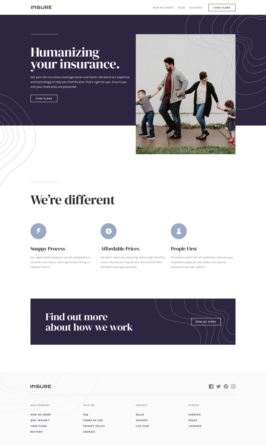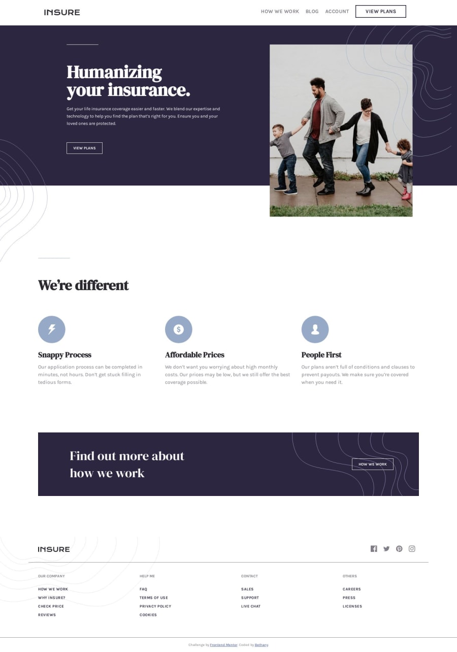
Design comparison
Solution retrospective
This project took a bit longer and it's certainly far from being pixel perfect, but I definitely learned quite a bit through the process. The part that is still bothering me a bit is the top section of the website (after the nav bar - the "Humanizing your insurance" part). The proportions and spacing are a bit off, but I wanted it to scale well. Recommendations on how to code that section more efficiently (and to better match the design) would be appreciated.
Thanks for taking a look!
Community feedback
- @clockwerkzPosted over 4 years ago
Looking good! The headline looks more condensed in yours vs the design; I think maybe adding 1px of letter spacing might help that.. or maybe it's the font weight? Also, in the mobile version it looks like the page is still using the desktop version of the hero image... I would recommend using srcset to switch from the desktop to the mobile version of the image.. Nice work!
2@whimsicurl-creationsPosted over 4 years agoThank you so much for taking a look and providing your feedback. I really appreciate your insight so I can continue to improve.
1@clockwerkzPosted over 4 years ago@whimsicurl-creations You bet! We're always learning!
0 - @LizzSoupPosted over 4 years ago
Hello, fellow skillcrusher.
Good work, and nice to see you on here! Hopefully someone can come through with the tips you're looking for.
I've found it really difficult to get things looking pixel perfect without the sketch files, though there are some chrome plug ins you could look into the might help you get it a little closer.
There's a very pale grey footer background that's missing on your version, should be an easy fix!
2@whimsicurl-creationsPosted over 4 years agoHello! Thank you for taking a look. I will certainly look at the footer background. I thought I had applied the light gray from the style guide, but perhaps I didn't. With each challenge I tackle, I'm learning more and building my skills. I look forward to improving with each one and becoming more confident in what I can do. Thanks again!
0
Please log in to post a comment
Log in with GitHubJoin our Discord community
Join thousands of Frontend Mentor community members taking the challenges, sharing resources, helping each other, and chatting about all things front-end!
Join our Discord