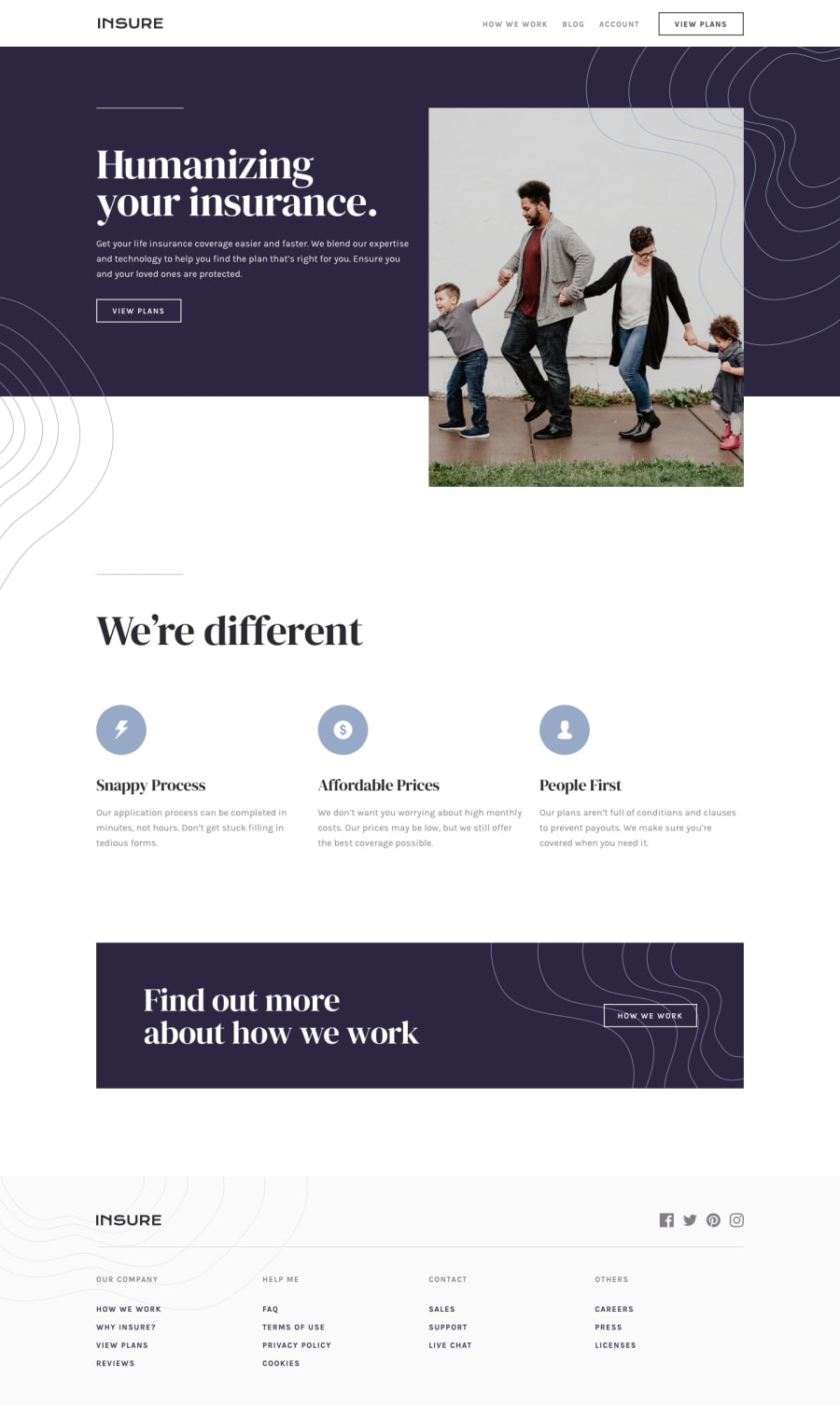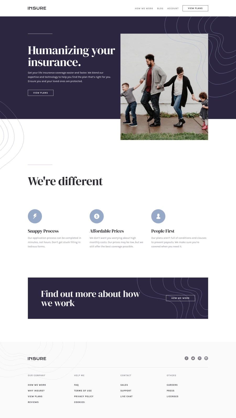
Design comparison
Solution retrospective
Hey everybody!
This has been one of the most advanced challenges I've worked on all by myself so far. I'm sure there's quite a few ways to improve my code, so if you got any hints for me I would be very grateful.
Also, please let me know if there's any kind of problem so I can attempt to fix them!
Community feedback
- @MojtabaMosaviPosted over 3 years ago
Hi!, Great stuff, looks nicec and reponds well. Looking att you markup the only thing that comes to mind is subtle modifications that you can make to make even more awesome.
1 I think in in some places your markup is bloated and keep in mind this is only my take on it. For example in you footer I think a sing nav element could do the job mainly because it's meant to contain the main navigation of a site. Another example is that in may places you define div for certain styles while you can accomplish the same thing without it, for example the column that you difine in your footer is not neccesary and you can put the styles on the footer-nav. This is only looking at you code through my dev glasses.
Keep coding :)
1@tihuskyPosted over 3 years ago@MojtabaMosavi
Yeah, I think I tend to make things too complicated. I hope it will get better with more experience! I'll try to make the markup for the footer a bit simpler at least.
Thank you for your feedback as well!
0 - @tedikoPosted over 3 years ago
Hello, Dex! 👋 Congrats on finishing another challenge! 🎉 Your solution looks very good and also responds well. Here's my few tips:
- It is good that you think about apply
:focus
pseudo-class to your interactive elements but keep in mind that focusable elements they have applied default:focus
pseudo class withoutline
property. These default styles are subtle and hardly visible tho. Furthermore every browser has a slightly different default style for the outline, so you probably want to change the default style. Read more about why we should change focus styles.
Good luck with that, have fun coding! 💪
1@tihuskyPosted over 3 years agoThanks for your feedback, @tediko!
That article was really interesting and I've tried to make the focus state on links, buttons and social icons more obvious 😃
0 - It is good that you think about apply
Please log in to post a comment
Log in with GitHubJoin our Discord community
Join thousands of Frontend Mentor community members taking the challenges, sharing resources, helping each other, and chatting about all things front-end!
Join our Discord