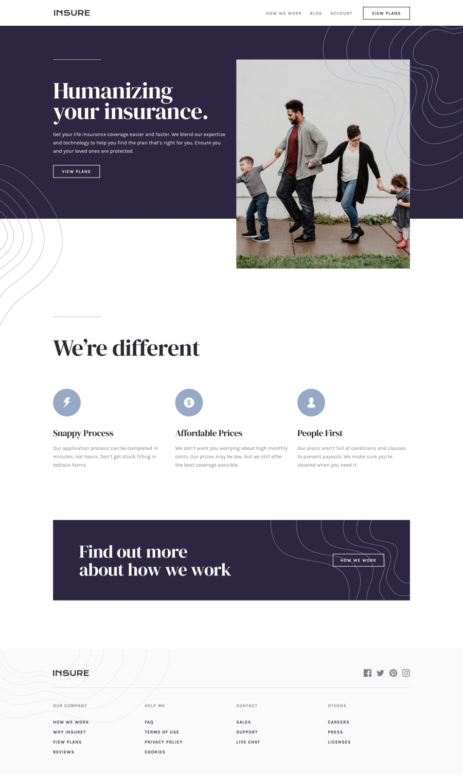
Design comparison
Solution retrospective
Not sure why... But when looking at the project on mobile view the top image has a small space on the right and for the life of me I could not figure out why. Also, my CSS is way too long but I felt like if I touched too much it would mess it up. I will try to build more efficiently on the next one. This one got away from me.
Community feedback
- @amalkarimPosted almost 2 years ago
Hi Shawtii,
Your problem is caused by this declaration:
.humanizing-section {
    ...
    margin: -4px;
    ...
}
After you remove that, there will be small space below the image instead. That could be removed by adding
display: block;to the image.Hope this helps. Happy coding
1@CrypticMangoPosted almost 2 years ago@amalkarim
Hello Amal
Ohhh! Thank you! I did not notice that. I will make the changes tomorrow. I appreciate you taking the time to look at my work.
Have a good rest of your week!
0
Please log in to post a comment
Log in with GitHubJoin our Discord community
Join thousands of Frontend Mentor community members taking the challenges, sharing resources, helping each other, and chatting about all things front-end!
Join our Discord
