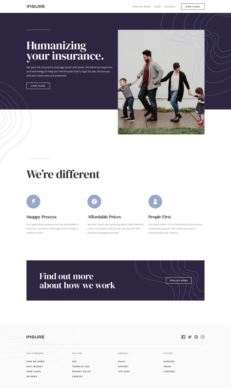
Insure landing page || using vanilla JS and sass
Design comparison
Solution retrospective
Any feedback on code and design will be appreciated...
I have added a lot of simple hover effect ... I have used sass to do this project any feedback on sass code or how I can write them better is welcomed...
Community feedback
- Account deleted
Hi, nice job on completing the challenge.
There's just a few suggestions that I have; On desktop I think the height of your navigation bar is too big, maybe try cutting it to a smaller size.
You should give the image a minimum height so it doesn't get too small.
Keep coding👍.
3@soransh-singhPosted over 3 years ago@thulanigamtee yhaa ... Height of navigation bar is too big... I think I have to remove some margin from nav
0 - @ApplePieGiraffePosted over 3 years ago
Greetings, soransh singh! 👋
Good effort on this challenge! 👍 Hover effects are definitely fun to play with! 😀
One small issue that I noticed is that the text in the individual features components in the "We're different" section overlap each other a bit when they are hovered over. You might want to avoid that as it can make the text inside difficult to read. 😉
I'd also suggest adding
width: max-contentto the links in the header of the page to prevent them from having line-breaks when the width of the page decreases (or better yet, allow the header navigation to take up more space so that there's more room for the links inside of it). 🙂Keep coding (and happy coding, too)! 😁
1@soransh-singhPosted over 3 years ago@ApplePieGiraffe thankss.... I will do this changes
0 - @DiuGachPosted over 3 years ago
Hi soransh-singh, My name is Diu Gach, I think your design and code looks nice. But few points though, I suggest that you add that basic functionality for the navigation menu so that when a user click an anchor item (nav) it should direct you to the corresponding page eg clicking blog should take a user to blog section(you can use # (IDs) for that). all the best and keep coding.💪
1@soransh-singhPosted over 3 years ago@DiuGach thanks ... for your feedback
I don't even used anchor tags😅😅 cause I thought it will be not much helpful
I will change it and try to add this ... Thanks
0
Please log in to post a comment
Log in with GitHubJoin our Discord community
Join thousands of Frontend Mentor community members taking the challenges, sharing resources, helping each other, and chatting about all things front-end!
Join our Discord
