Submitted almost 3 years ago
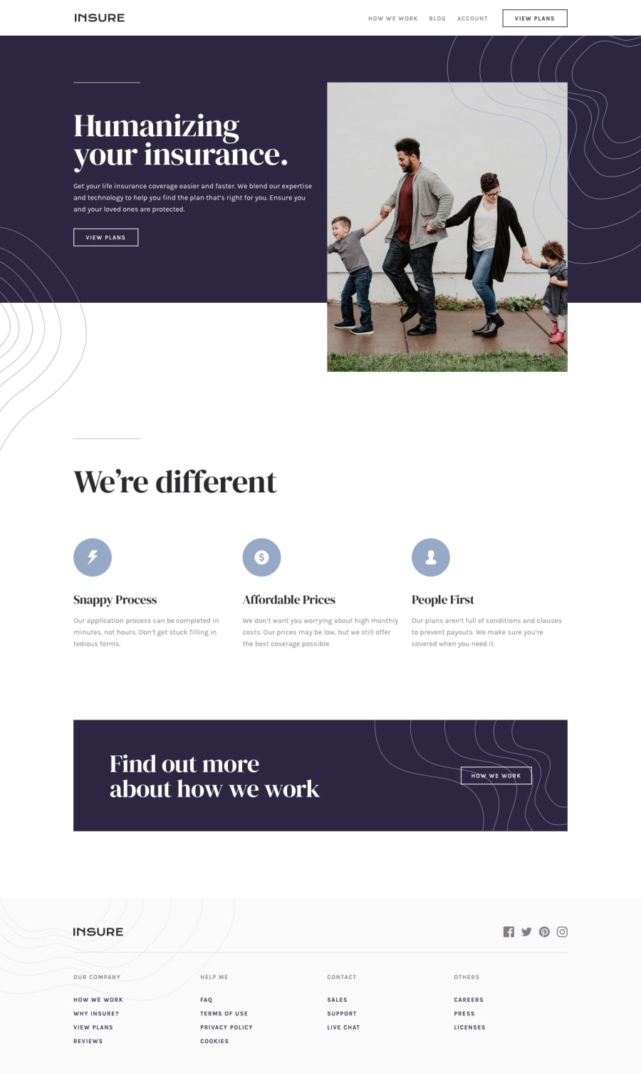
Insure landing page using SCSS, HTML5, JS
@peterramirez18
Design comparison
SolutionDesign
Solution retrospective
Hello guys! Any feedback is very important!
Community feedback
- Account deleted
Hi there 👋
Your design looks beautiful 😃. There was 2 difference that I could find 😉. For Description text under icons in the section called
We're differentchange the colors to a lighter color. The second is links in the footer look darker. Let's also decrease their font-weight 👍Happy coding ☕
0
Please log in to post a comment
Log in with GitHubJoin our Discord community
Join thousands of Frontend Mentor community members taking the challenges, sharing resources, helping each other, and chatting about all things front-end!
Join our Discord
