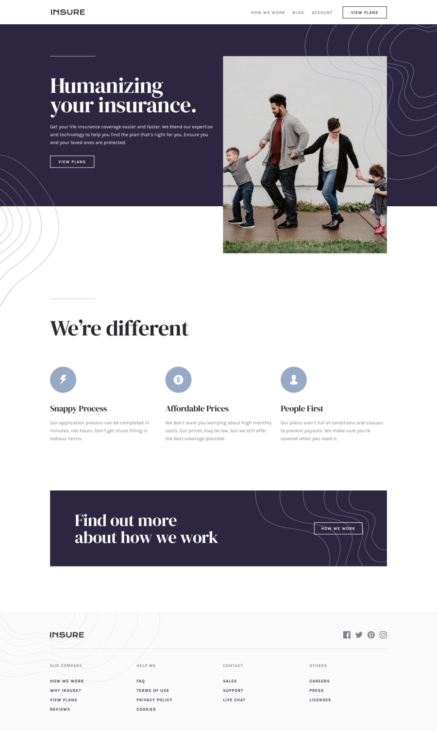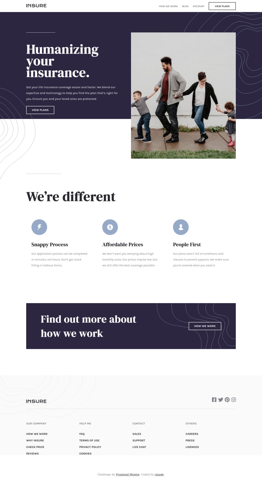
Insure landing page using Sass and bundled by webpack
Design comparison
Solution retrospective
Any tips for organizing my files. Especially in my .scss files, I just randomly shoved my files in folders :)
Community feedback
- @brasspetalsPosted over 2 years ago
Hi, Claude! Congrats on submitting another solution. π
When it comes to Sass/SCSS architecture, the 7-1 pattern seems to be considered the standard. However, it can be a bit overkill for smaller projects, so there are some simpler organization methods - like the 5-1 pattern. Hopefully these will give you an idea of how you can better organize your files. π
A few other suggestions to make your solution even better:
::before
and::after
pseudo-elements are very handy for decorative image placement like the swirl patterns in the intro.- For better semantics,
.footer__links
could be anav
element with anaria-label
with something like βfooter menuβ in order to distinguish it from the nav in the header. The link headers and links themselves might also be better suited as aul
with links insideli
tags like you did in the header menu. - From about 620px ~ 1100px, the style is very cramped. I suggest adding another media query to account for tablet widths so that your solution looks good on all screen sizes.
Marked as helpful0@claude1018Posted over 2 years ago@brasspetals Thanks for suggestions..
The decorative images part in the intro part takes me time to decide what to do
I forgot you could also call the .footer__links as nav.
I know its cramped to the middle size because I though to only copy the mobile and desktop design. But in my future projects/challenges here I will try to add a media query for tablet.
1@brasspetalsPosted over 2 years ago@claude1018 The decorative images are very tricky on this challenge. Just throwing out another suggestion. π Pseudo-elements make it really easy to place things without interrupting the rest of the dom or cluttering up HTML. However, there's nothing wrong with how you handled them here. π
I think it's good practice to always make sure your projects look good on all screen sizes. However, this can be difficult as the free challenges do not provide you with a tablet design, so you have to just make one up for yourself.
Anyway, good job on this one and happy coding! π
Marked as helpful0
Please log in to post a comment
Log in with GitHubJoin our Discord community
Join thousands of Frontend Mentor community members taking the challenges, sharing resources, helping each other, and chatting about all things front-end!
Join our Discord