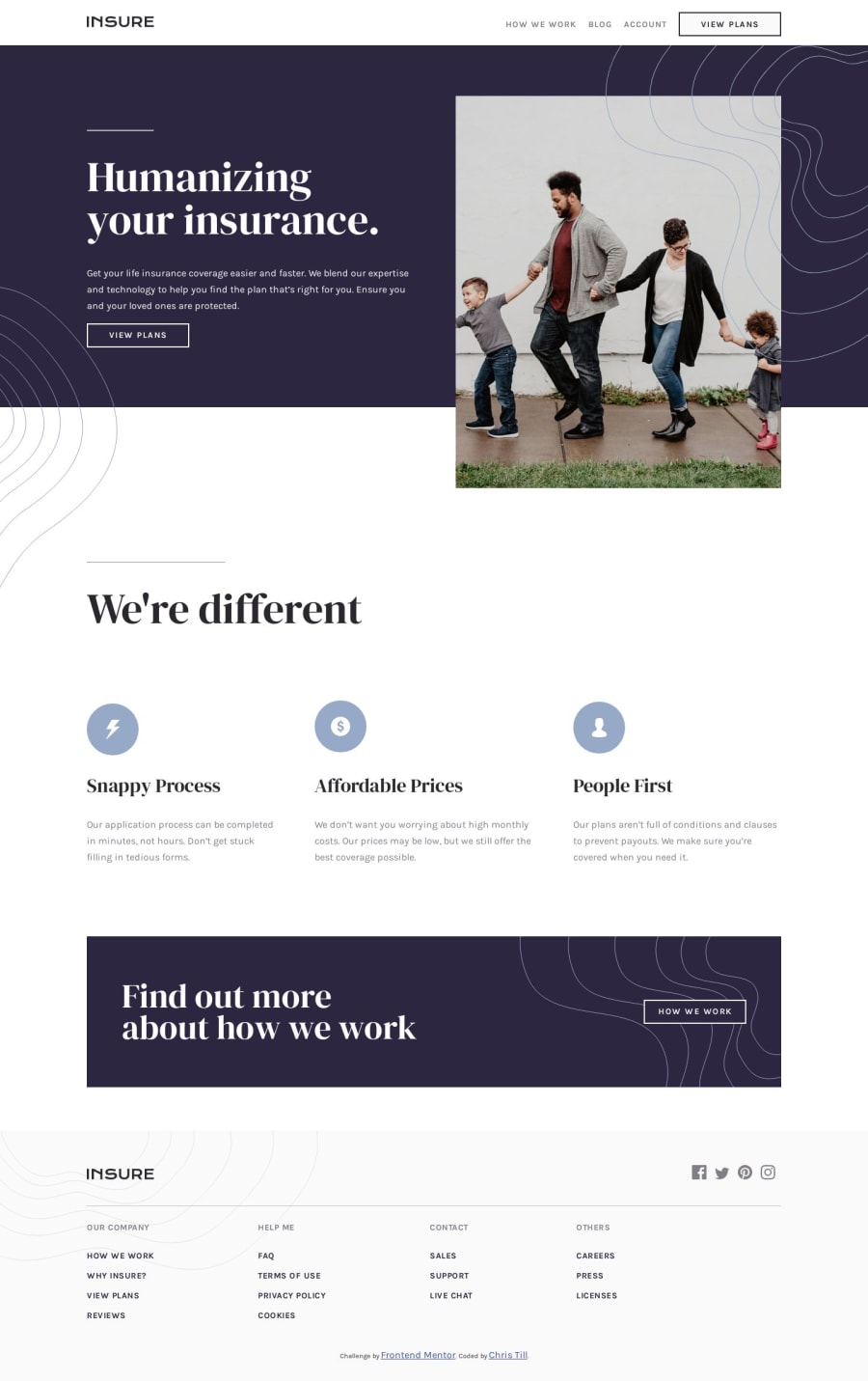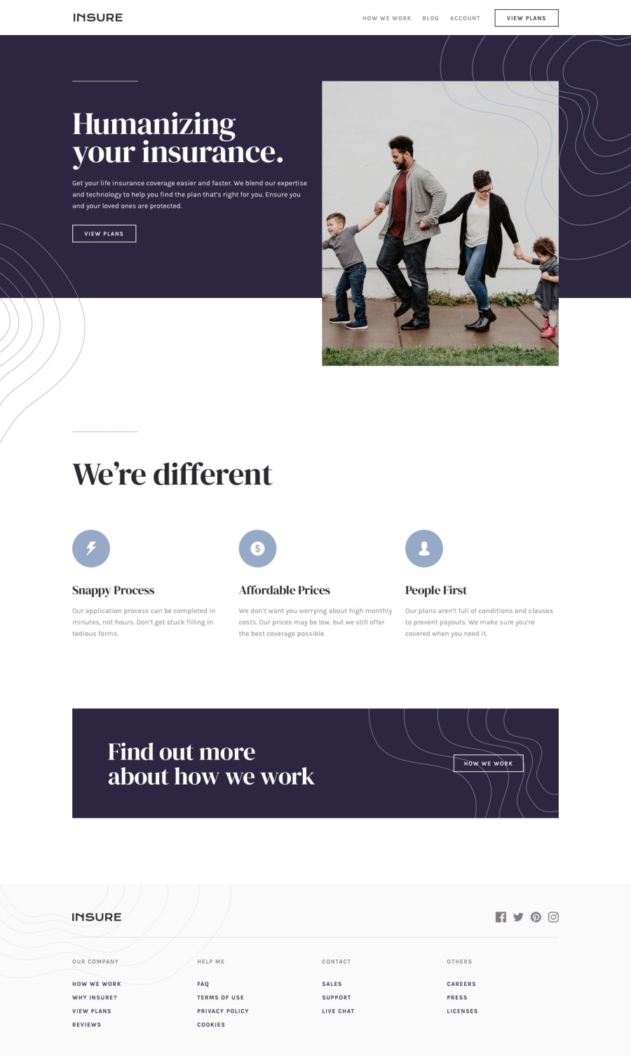
Insure Landing Page using SASS and animations.
Design comparison
Solution retrospective
Please let me know what you think of everything. I feel like I'm improving with SASS quite a bit but I still have a long way to go. Any advice regarding my use of SASS would be appreciated.
Community feedback
- @davidomarfPosted over 4 years ago
Wow, definetely gonna steal some tricks from your SCSS file.
I haven't used mixins yet. And just by reading your code I think I "got it".
The only thing that I'd change, is the order of the properties. I like this approach:
https://webdesign.tutsplus.com/articles/outside-in-ordering-css-properties-by-importance--cms-21685
>
The order I use is as follows:

Layout Properties (position, float, clear, display)
Box Model Properties (width, height, margin, padding)
Visual Properties (color, background, border, box-shadow)
Typography Properties (font-size, font-family, text-align, text-transform)
Misc Properties (cursor, overflow, z-index)

I know that border is a box-model property and z-index is related to position,
but this order works for me. Even though I don't like alphabetical ordering,
there's something that just feels right about putting z-index at the end...
But it's just an opinionated comment.
Great solution and great use of transitions.
2@chri55Posted over 4 years ago@davidomarf Thank you! And glad to help. I had just read about mixins so I don't know if it's common to do what I did, but I did feel better writing less code using the mixins I made.
Also, thanks for the resource! I will definitely use that from here out, my brain likes having that kind of organization 😝.
0 - @bashirogluPosted over 4 years ago
@chri55 Hi, I think you used mixins well. And the design looks perfect. I don't know you are familiar with BEM naming or not. BEM matches well with sass. for example
// Let's say we have a div name here and inside of it hero we have here__text-box
<div class="hero"><div class="hero__text-box"></div></div>

// we can target them as follows
.hero{
//for hero
    &__text-box{
    //  for hero__text-box
    }
}
this is something we want because we target element with only 1 selector (not nesterd, nesting is only in sass not in css) and it is good for later specificity issues. also, we don't write hero :) every time in saas) You can use this method if you like, for more information keywords are BEM and BEM in sass. Good luck.
1@chri55Posted over 4 years ago@bashiroglu Thank you, first of all 😁That's pretty interesting about BEM, I have not heard of it until now but I will research, it seems like it can be used for better code organization, which is great!
0 - @MuhammadHassaanMahmood5550Posted over 4 years ago
I have also tried this challenge, but i was unable to use or get icons given in the starter files because they were in browser file. I have no idea, not a bit how to use or find these icons. Can you guide me how can i use that specific given icons on my webpage?
0@chri55Posted over 4 years ago@MuhammadHassaanMahmood5550 Hi, looking at your solutions it seems that the SVGs are what is giving you trouble?
The SVGs themselves are composed of code since they are vector graphics and therefore are drawn out using a series of mathematical commands to create lines, curves, etc., which is likely what you saw in the browser.
Luckily, support for visualizing them is built into the browser, and you can use them similar to
.jpgor.pngfiles, by loading them into an<img>tag. See this code on my GitHub for an example of loading in the Social Media Icons SVGs using this method.The other method is to utilize them as a background image to a certain container, as I've done here in my scss code.
Hopefully this clears things up and I was able to help you out with using the assets! Happy coding.
0
Please log in to post a comment
Log in with GitHubJoin our Discord community
Join thousands of Frontend Mentor community members taking the challenges, sharing resources, helping each other, and chatting about all things front-end!
Join our Discord
