Submitted about 3 years ago
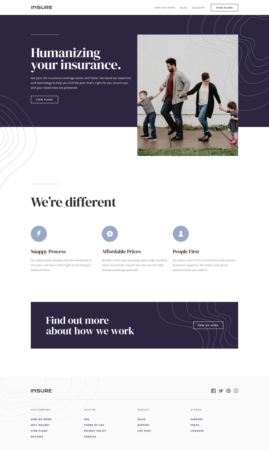
Insure Landing Page using ReactJs and Tailwind
@Rzkykhrllh
Design comparison
SolutionDesign
Solution retrospective
Hello Everyone👋
This was a fun and challanging challange. In this challange, i learned more about absolute-relative position
In the begining, i was really confused to figure the design between mobile and desktop because Front end Mentor only provide two design. So i come with this approach. If you have any other approach of the design just tell me.
Also, If you have any feedback it will be appreciated
Thankyou
Community feedback
- Account deleted
Your approach is pretty standard, you have to cater for every screen size not just the one's that are mentioned in the styles guide.
- I think your solution looks ok, and everything works... & the pattern on the mobile menu only covers a small portion of it, it should cover the whole width.
Marked as helpful0
Please log in to post a comment
Log in with GitHubJoin our Discord community
Join thousands of Frontend Mentor community members taking the challenges, sharing resources, helping each other, and chatting about all things front-end!
Join our Discord
