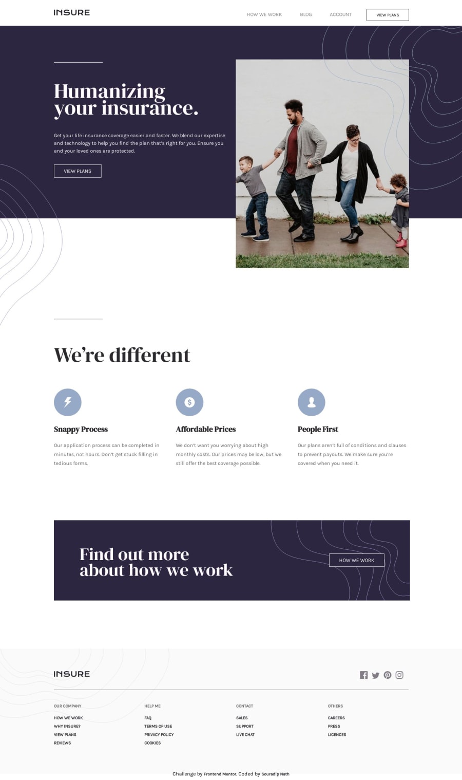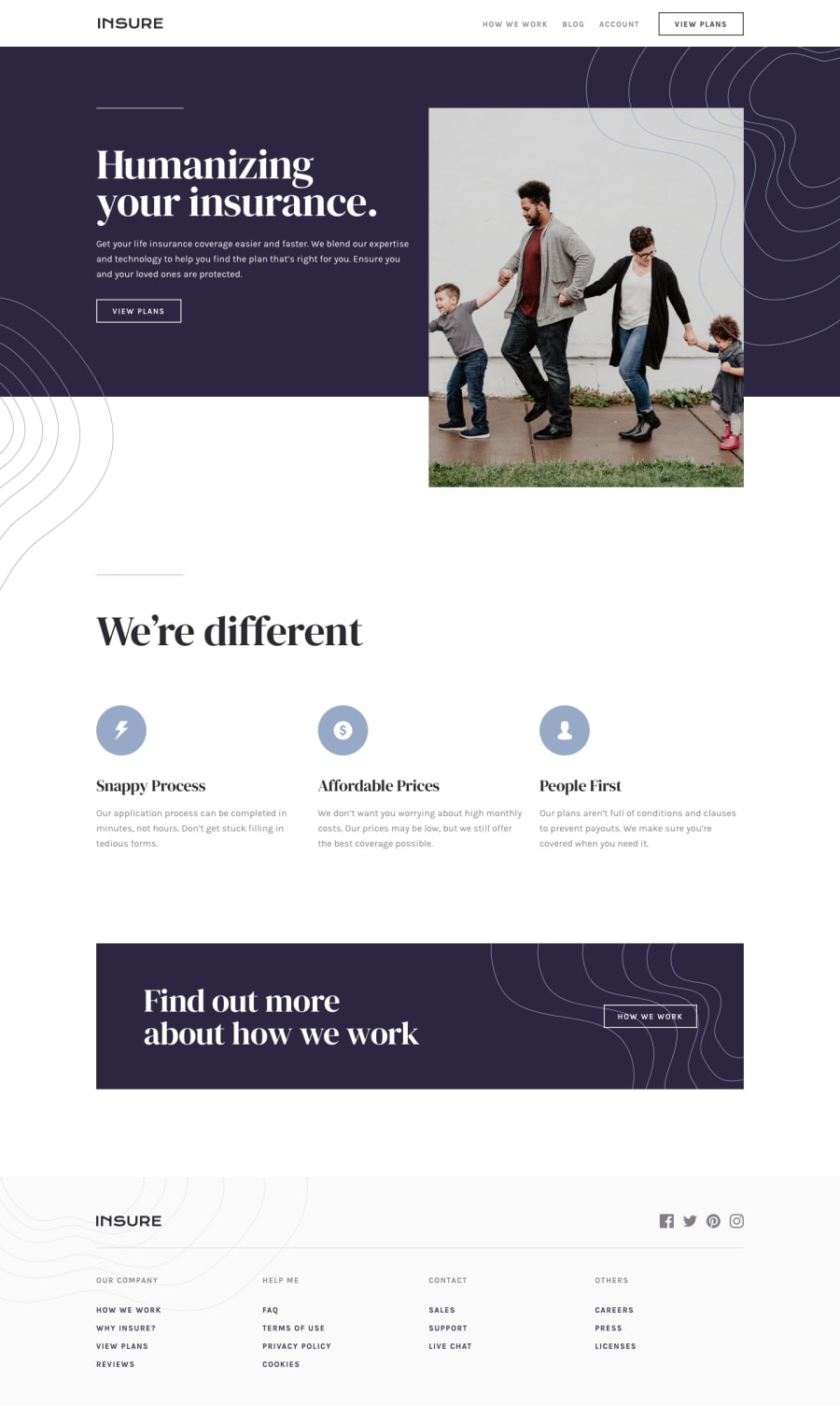
Design comparison
Solution retrospective
Please share your feedback!
Community feedback
- @krebeDevPosted almost 5 years ago
The design is great on desktop/large screens. I suggest you include media queries by introducing different breakpoints/CSS rules to make it responsive in smaller viewports.
1 - @mattstuddertPosted almost 5 years ago
You've done a really good job of replicating the desktop design. As Solomon has mentioned, a great next step would be to turn this into a responsive web page.
I notice you're using
position: absolute;to position most of your content. I'd recommend avoiding this, as you're essentially sticking elements in place. This will lead to issues, especially when trying to make it responsive. Instead, I'd recommend looking into using Flexbox and CSS Grid for layout purposes. They're really powerful tools!Let me know if you have any questions. Keep up the great work!
0
Please log in to post a comment
Log in with GitHubJoin our Discord community
Join thousands of Frontend Mentor community members taking the challenges, sharing resources, helping each other, and chatting about all things front-end!
Join our Discord
