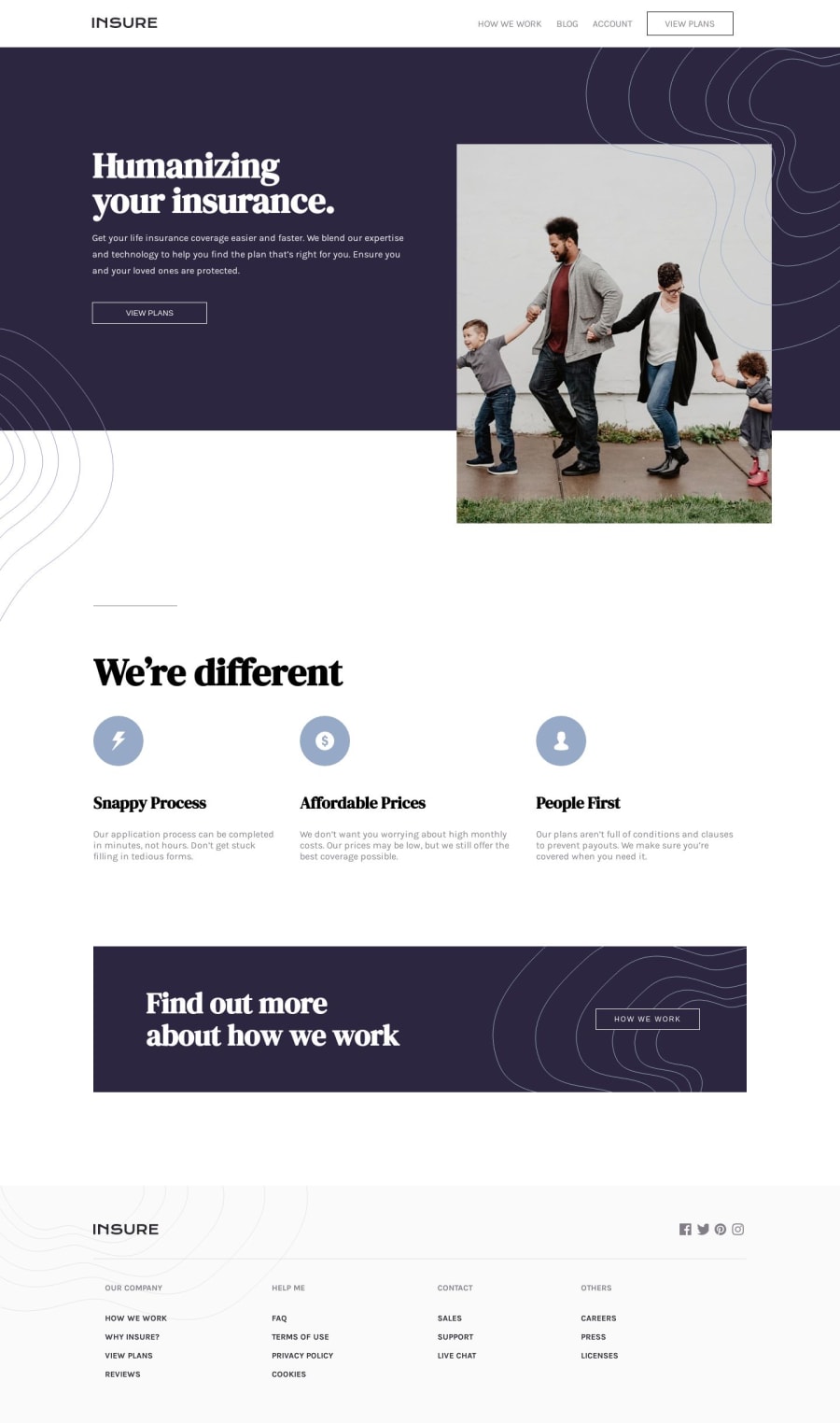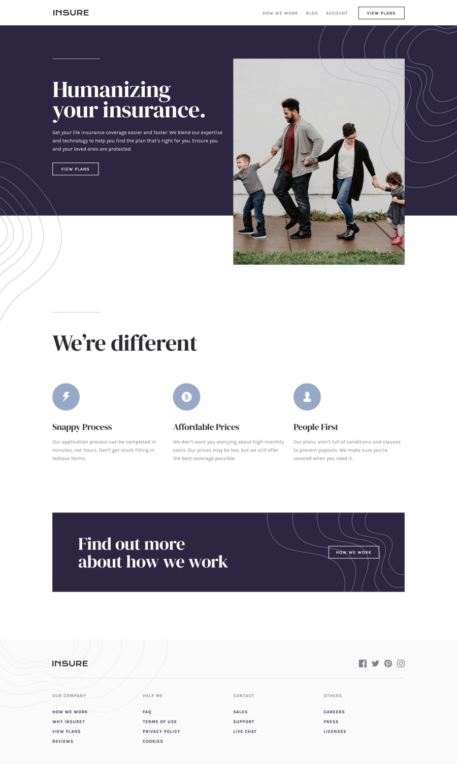
Design comparison
SolutionDesign
Community feedback
- @ramsaysewellPosted over 4 years ago
Hi Bhanu,
Really great job on this challenge, it looks amazing!
I like the level of responsiveness that you've managed to implement into this page.
I would like to see the navigation header inline with the
.introimage. You may have to place the image relative to the flow and usetransform: translateY()for this to be inline with the container's boundaries.There are also a few places with the incorrect
font-weightorborder-width, but that's just me being picky 😃Great job!
Ramsay
3
Please log in to post a comment
Log in with GitHubJoin our Discord community
Join thousands of Frontend Mentor community members taking the challenges, sharing resources, helping each other, and chatting about all things front-end!
Join our Discord
