Submitted over 4 years ago
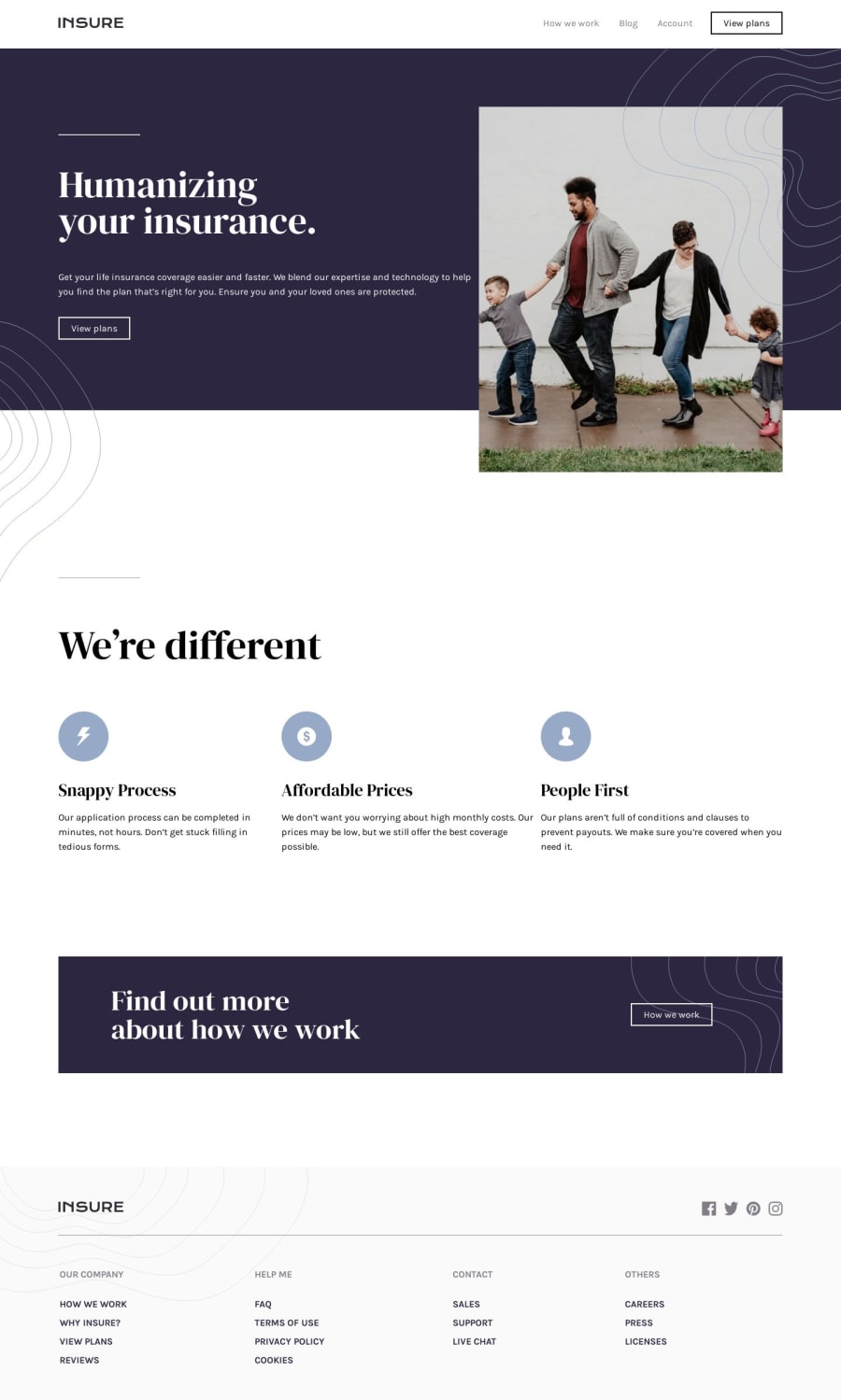
Insure landing page using HTML, CSS, and JavaScript
@thisisobate
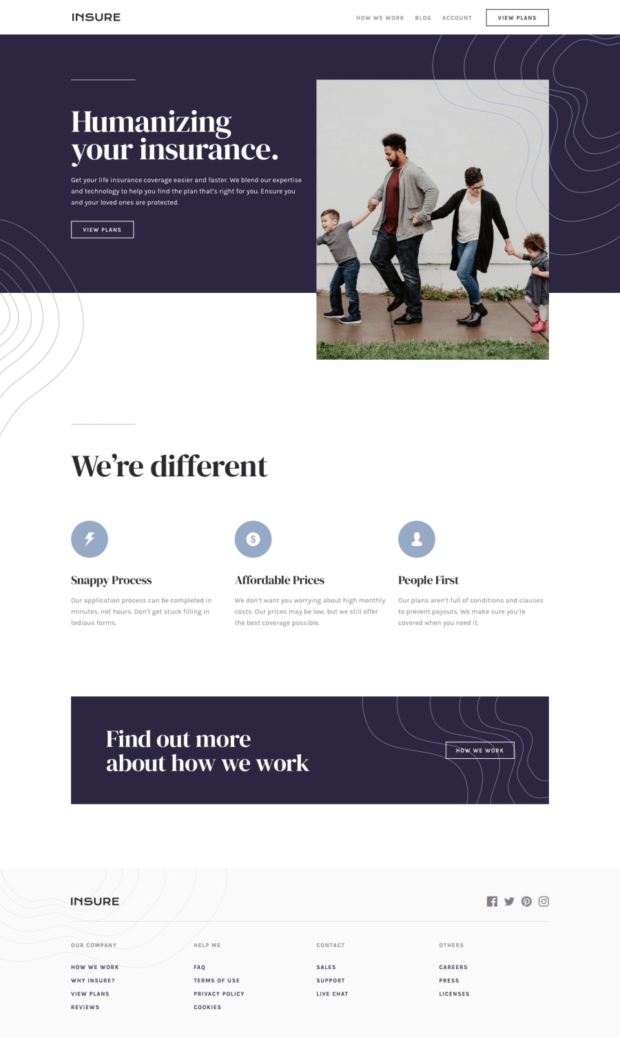
Design comparison
SolutionDesign
Solution retrospective
Please review! I need your honest criticism
Community feedback
- @GerbenDolPosted over 4 years ago
Hi Uchechukwu! Your solution looks really good! There's a few details I think would really make it killer 💯
- On bigger screens the content gets very wide. I'd try and limit the width so that texts don't become too long (Read more about how people read here)
- Try adding the different
:hoverstates to stuff like buttons and navigation items - Uppercase (
text-transform: uppercase;) the text of your buttons - Center the navigation in the footer on mobile (it has a lot of margin-right currently)
- When building these solutions try to go for as much detail as possible. So even when you don't have actual links to link to in the footer, still make them
<a href="#">tags. There's times where this introduces new problems, so also new stuff to learn from!
All in all I think you did an awesome job. Keep up the great work! 💪🏻
2@thisisobatePosted over 4 years ago@GerbenDol Thanks alot for the feedback. This was really helpful. I will try effect the changes as soon as possible.
1
Please log in to post a comment
Log in with GitHubJoin our Discord community
Join thousands of Frontend Mentor community members taking the challenges, sharing resources, helping each other, and chatting about all things front-end!
Join our Discord
