Submitted almost 5 years ago
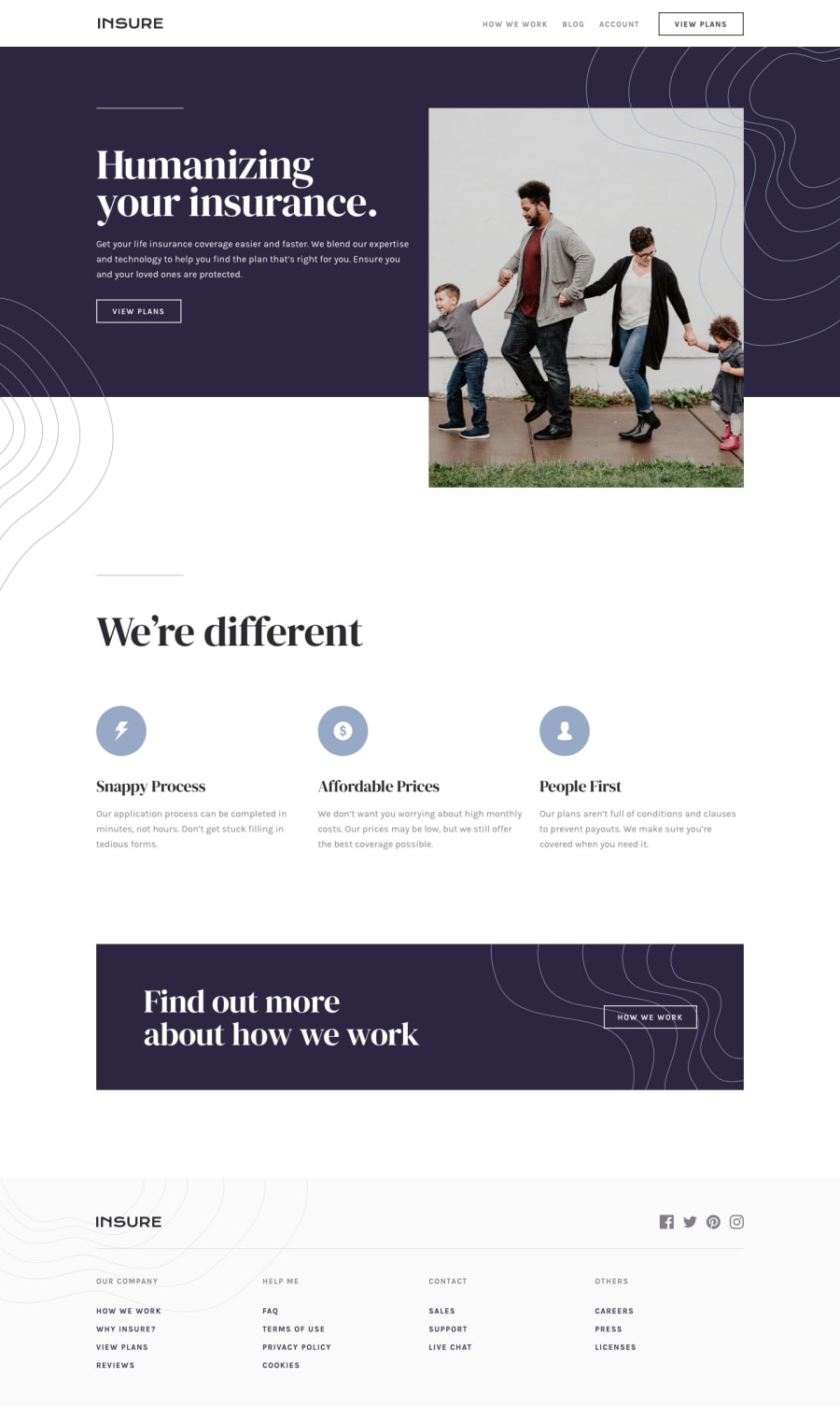
insure landing page using grid and flex css
@fadzrinmadu
Design comparison
SolutionDesign
Solution retrospective
please review my code and let me know what i need to improve, thanks in advance
Community feedback
- @mattstuddertPosted almost 5 years ago
It looks great, Muhammad. Nice work! As you can see from the design comparison the only real tweaks are small vertical spacing issues and minor refinements 🙂👍
I'd also recommend not using multiple
h1elements as it can lead to accessibility issues for screen reader users. Keep up the great work!1@fadzrinmaduPosted almost 5 years agoi will fix it. thank you @mattstuddert for your feedback.
0
Please log in to post a comment
Log in with GitHubJoin our Discord community
Join thousands of Frontend Mentor community members taking the challenges, sharing resources, helping each other, and chatting about all things front-end!
Join our Discord
