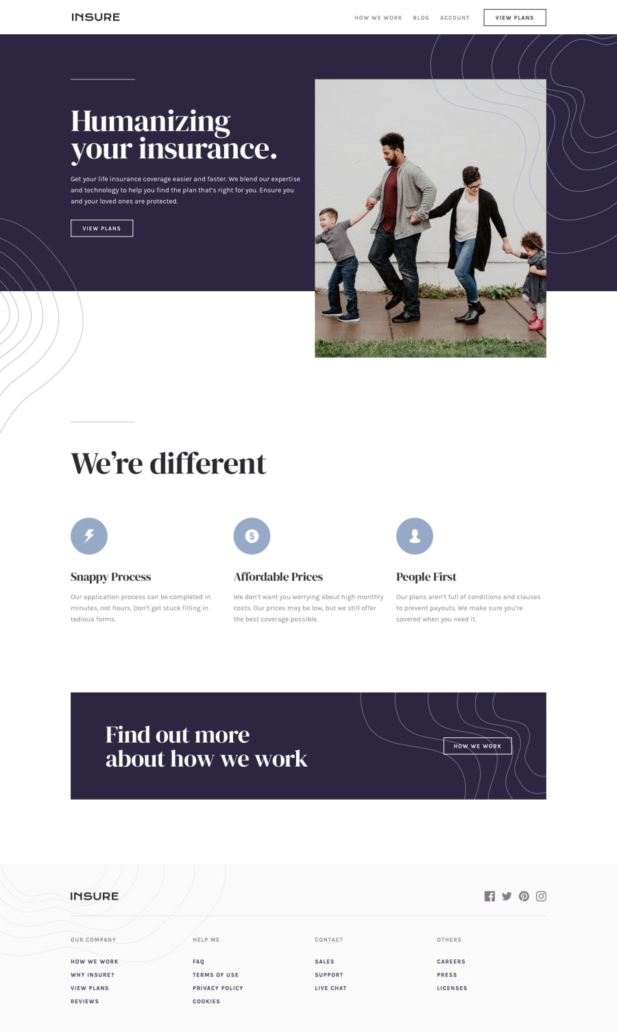
Design comparison
SolutionDesign
Solution retrospective
What are you most proud of, and what would you do differently next time?
I'm most proud of my pacing right now. I will strive to improve it through out my summer break
What challenges did you encounter, and how did you overcome them?Some parts of the design is hella confusing. The footer links for example don't have equal spacing in the design. I overcome it by deciding to put an equal spacing so that it's uniform to look at.
What specific areas of your project would you like help with?If you any suggestion about improving the accessibility, I'm open for feedback. Thanks!
Community feedback
Please log in to post a comment
Log in with GitHubJoin our Discord community
Join thousands of Frontend Mentor community members taking the challenges, sharing resources, helping each other, and chatting about all things front-end!
Join our Discord
