Submitted over 4 years ago
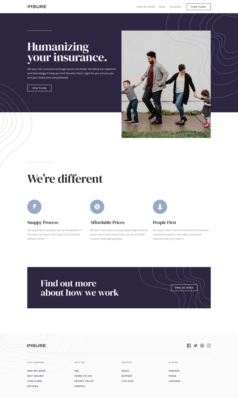
Insure Landing Page using Flexbox and a bit of Grid (HTML/SASS/JS)
@LeshyNL
Design comparison
SolutionDesign
Solution retrospective
A bit tricky to get everything into the right place, but I think it worked out well enough. Also tried to meet some accessibility requirements for the menu.
Any feedback and/or suggestions are welcome!
Community feedback
- @dhillman1989Posted over 4 years ago
Having attempted this one myself I agree the placing of elements was tricky at times, but you have done a fantastic job here.
1
Please log in to post a comment
Log in with GitHubJoin our Discord community
Join thousands of Frontend Mentor community members taking the challenges, sharing resources, helping each other, and chatting about all things front-end!
Join our Discord
