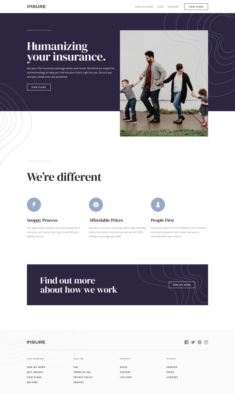
Design comparison
Solution retrospective
Let me know if any errors/improvements. Still trying to cut down on css lines.
Community feedback
- @shake88juntPosted about 3 years ago
Very good suggestions for organization and sematics. I appreciate it so much. A lot of the alt tags and such I am quite lazy to fill in. Although, I should treat these products more seriously to form good practices. Great idea to include the links inside <a> tags and use button tag for buttons. I usually just wrap all my content inside <main>, but I guess I could put a header above.
0 - @pikapikamartPosted about 3 years ago
Hey, great work on this one. Layout in desktop is good as well as for the mobile layout. The responsiveness is great.
Some suggestions would be:
- The
.navbarselector could have usedheaderelement. In a typical website, the upper portion that holds the website logo as well as the navigational links are inside theheader. - The website logo in the
headershould have usedalt="insure"since theimgalready has the text on it. Avoid adding words that relates to "graphic" like "logo, image, icon, picture..." as a value foraltattribute. Assistive tech will handle those for you. - The list of links in the
headershould have been inside thenavelement. These are the primary navigation links of your website, always have it insidenavelement. Also, useatags on them, they are links right, better use proper html elements, especially when they are links: - After the
header, always have amainelement that will wrap the whole content.mainelement is a landmark that helps users to properly navigate your website. On this one, it will wrap the hero-section, going down to the cta-section. A normal html structure would look like:
<header /> <main /> <footer />- The
view-planson the hero-section should have been usingatag as well. Also, do not usedivalone when using as an element, to an element which is interactive. Interactive element should usebuttonoratags. - The
altfor the hero-sectionimgcould have use betteralton it. If theimgadds content to the website, use a descriptivealtvalue on it. - Avoid using multiple usage of
h1element. Always have at least only 1h1element. - Also on the
we're differenttext, it should not be inside aheaderelement. Since you are not usingsectionorarticleelement. - The
altfor the icons on thewe're differentpart should have been left empty likealt="". A good rule of thumb, if animgadds content the website, use a descriptivealton it, but if theimgjust acts purely decoration then usealt=""on it. how we workshould have been usingatag as well.
FOOTER
- Website logo should have been using
alt="insure"as well. - The social media links should have been using
atags since those are links. - The list of links in should have all used
atags and needs to be insidenavelement, since those are navigation links of your website.
MOBILE
- The hamburger dropdown should have been using
buttonelement and not justdivorimg. Those elements are not accessible and wrong on this kind of component. - The
buttonfor the hamburger dropdown also should usearia-label="menu dropdown toggler"so that users will know what thisbuttonshould do. - The
buttonfor the hamburger dropdown also should havearia-expandedattribute on it. This will be changed via javascript, this informs a user that a dropdown has expanded. - Also, clicking the hamburger dropdown, it removes the
imgelement and only shows thealttext on it.
Aside from those, you still did a great job on this.
0@shake88juntPosted about 3 years ago@pikamart I honestly don't like the <button> tags because of the base styling
0@pikapikamartPosted about 3 years ago@shake88junt Even if you don't like it, those are the proper tag to use, because if you don't use it, then the component is not accessible, and it is our job to make web accessible to everyone.
Also on the
buttonyeah, you could add:button { border: none; }So that the default style will be removed
0 - The
Please log in to post a comment
Log in with GitHubJoin our Discord community
Join thousands of Frontend Mentor community members taking the challenges, sharing resources, helping each other, and chatting about all things front-end!
Join our Discord
