Insure Landing Page Using CSS Grid & JS (Commented & Organised Code)
Design comparison
Solution retrospective
I will be really grateful if I can get my code reviewed. Any feedback on how to further improve it are welcome. Thanks!
Community feedback
- @mattstuddertPosted over 4 years ago
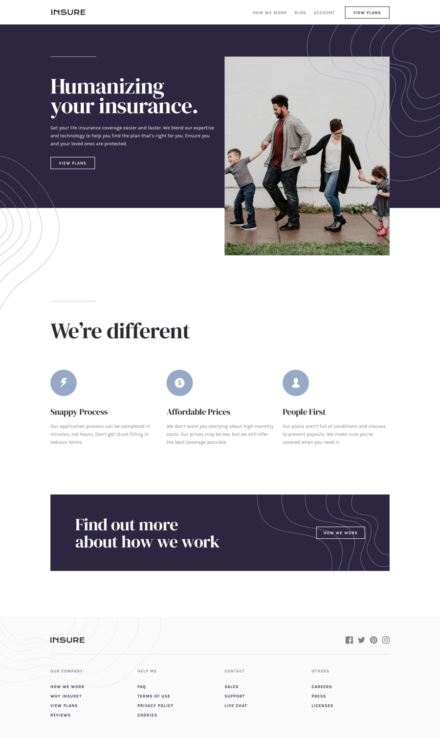
Nice work on this challenge! You've done a really good job. You can see from the design comparison above that your overall layout is really good. The major areas you could tweak would be things like spacing,
font-weight, andfont-sizeto get it to really match up to the design. It's well worth spending the time to make these refinements, as attention to detail is a great skill to build up as a front-end developer.I noticed your main image often gets squashed or stretched. This is because you're setting the
heightandwidthon it. There are two possible solutions:- Avoid setting both the
heightand thewidth. If you only set one of them, the other will take care of itself. I typically prefer setting thewidthand leaving theheightto be calculated automatically. - If you really need to set both of them, use
object-fitto make sure the image always maintains its aspect ratio. The value I use most often for this iscover. So the full declaration would beobject-fit: cover;.
I hope that helps. Keep up the great work and let me know if you have any questions! 🙂
1@aashish-cloudPosted over 4 years ago@mattstuddert I am really thankful that you took the time out to review my code. I totally understand the key areas you are asking me to focus on and I will surely work on them to refine my work.
Though I am kinda confused about sizing the images.
-
If I go with the first option i.e., to set either width or height. I usually end up getting something which doesn't look good on page. ( It usually becomes too small that I will have to change the whole hero-section and it will effect the spacing of the whole page further, which doesn't sounds like a nice idea. )
-
So I move on to the second option, i.e., setting up both height and width on my own. Which, as you said, results in disturbing the aspect ratio of the actual image and making it look stretched or squashed. I tried setting up the
object-fit: coverbut it results in cropping/clipping the image if the aspect ratio of the image cannot be maintained in the defined height and width. Which also doesn't look nice.
Can you please tell me how can I counter that ? And once again I am really really thankful that YOU took the time out to review it. It means a lot.
Thankyou - Aashish
1@mattstuddertPosted over 4 years ago@aashish-cloud you're welcome! On your first point, you could add a media query to change the layout when the image starts to look too small. On the second, having parts cropped off is a better outcome than the whole image being distorted. It's not ideal but sometimes it has to happen! 🙂
1@aashish-cloudPosted over 4 years ago@mattstuddert Sure! I got your point and I will keep these things in mind. Thank you so much for your support. 🙂
0 - Avoid setting both the
Please log in to post a comment
Log in with GitHubJoin our Discord community
Join thousands of Frontend Mentor community members taking the challenges, sharing resources, helping each other, and chatting about all things front-end!
Join our Discord
