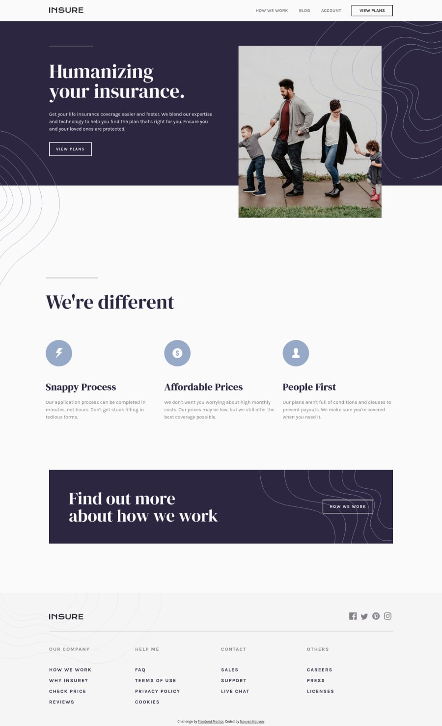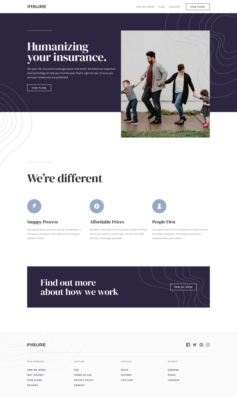
Insure Landing Page (took me over a month, please give me feedbacks)
Design comparison
Solution retrospective
Hello, it's been a while since my last project. This one was challenging because I just started doing "Junior" level projects. I hope to receive as many feedbacks as I can. Thank you in advance!
Questions: 1- How can I make the sliding transition of my mobile menu smoother? 2- How can I make my webpage look better at about 945px? The image got cut off top. 3- Any suggestions on my javascript?
Other feedbacks are always welcome, ofc! Happy coding!
Community feedback
- @ApplePieGiraffePosted over 2 years ago
Hello, Nguyen Nguyen! 👋
Good work on this challenge! 👍 Your solution looks good and your HTML is semantic! 👏
Here are a few things I'd like to suggest,
- Adding some hidden text inside of or adding an
aria-labelto each of the social media links in the footer of the page. That's so that these elements can be identified by screen readers. Doing so should help get rid of a couple errors on your solution report. 😉 - Adding
overflow-x: hiddento thebodyto prevent any unwanted horizontal scrolling on the page. - Adding a max-width to some of the text elements on the page in table views so that they aren't so wide when the layout first changes from desktop to tablet (this should help improve the look of a couple of things at around 945px).
- Considering splitting your Sass file into smaller files (called partials) since your main Sass file is quite long (over 400 lines). Doing so will help keep your project organized and make it easier to write and maintain your styles.
Hope you find this helpful. 😊
Keep coding (and happy coding, too)! 😁
Marked as helpful2@ApplePieGiraffePosted over 2 years agoOne more thing! 😆
If you'd like to make the transition of your mobile menu smoother, set the value for
leftfor the menu container to-100%(not-1000px). This'll ensure that the container is offset to the left by just the right amount and the transition in/out will be much slower and therefore smoother. 😉Marked as helpful1@jesuisbienbienPosted over 2 years ago@ApplePieGiraffe wow! thank you so much for your response. I really appreciate it.
1 - Adding some hidden text inside of or adding an
Please log in to post a comment
Log in with GitHubJoin our Discord community
Join thousands of Frontend Mentor community members taking the challenges, sharing resources, helping each other, and chatting about all things front-end!
Join our Discord
