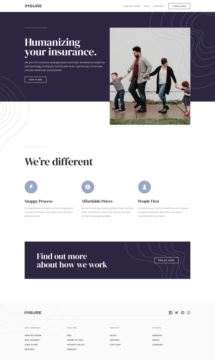
Insure Landing Page (TailwindCSS)
Design comparison
Solution retrospective
🛸 Hello FEM Community! I'm Daniel and this is my solution for this challenge! 😊
🛠️ Built with:
- HTML 🧾
- Tailwind 👾
- JavaScript 🤖
- Mobile first workflow approach 📲
I tried Tailwind again on this one. I've been trying to finish bigger projects using only Tailwind, but there's always one thing or two that I'm not able to create with it so I have to use a bit of pure CSS too.
Anyway, it took me a few hours to finish, but I enjoyed every minute of it.
Again, thanks to the Front-End Mentor team that creates challenges that make us learn a lot from doing them. 💟
If you have any suggestions on how I can improve this project, feel free to leave me a comment!
Feedback welcome 😊
Community feedback
- @tinuolaPosted 12 months ago
@danielmrz-dev,
Looks great and kudos on the use of Tailwind. 👍🏾
A suggestion for what to improve on would be to make the nav menu keyboard accessible when the menu collapses. Currently, when the screen resizes down the first clickable/focusable element is in the body, not the nav.
Starting to consider accessibility beyond native elements can be a great skill to practice and cultivate as a frontend developer.
Marked as helpful1P@danielmrz-devPosted 12 months ago@tinuola
Thanks. Menus are still a challenge for me 😅
1 - P@DeyanTopalovPosted 12 months ago
Hi @danielmrz-dev job well done once again!
Just one little thing - the layout get's a bit weird on ultra-wide screens. If you decide to update the code, the solutions are many and super simple. A simple scenario can be:
<body className="grid place-items-center">

  <main className="max-w-[90rem]">

    {rest of the code}

  </main>

</body>
Marked as helpful1
Please log in to post a comment
Log in with GitHubJoin our Discord community
Join thousands of Frontend Mentor community members taking the challenges, sharing resources, helping each other, and chatting about all things front-end!
Join our Discord
