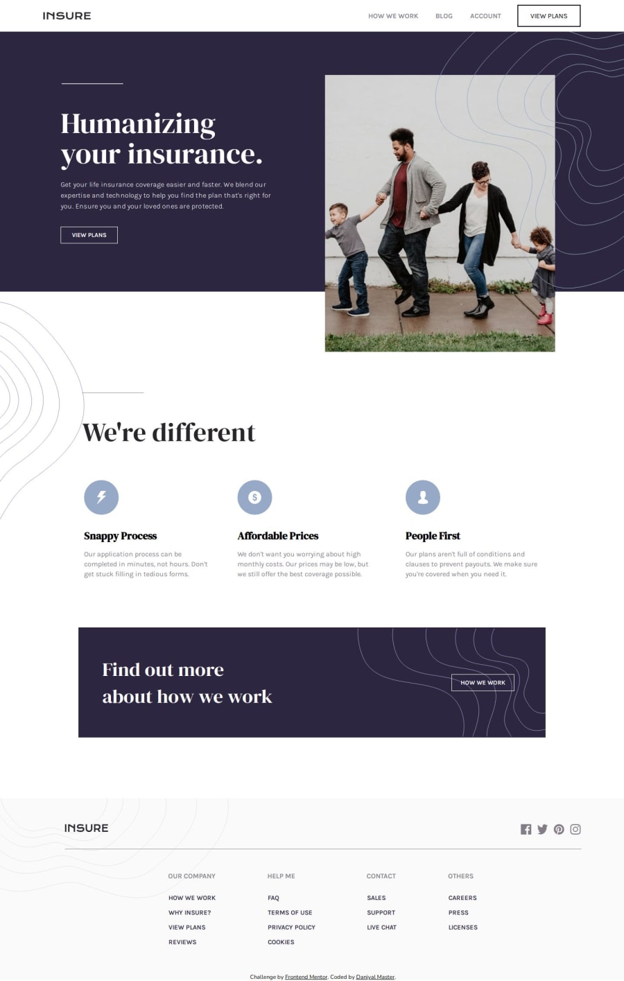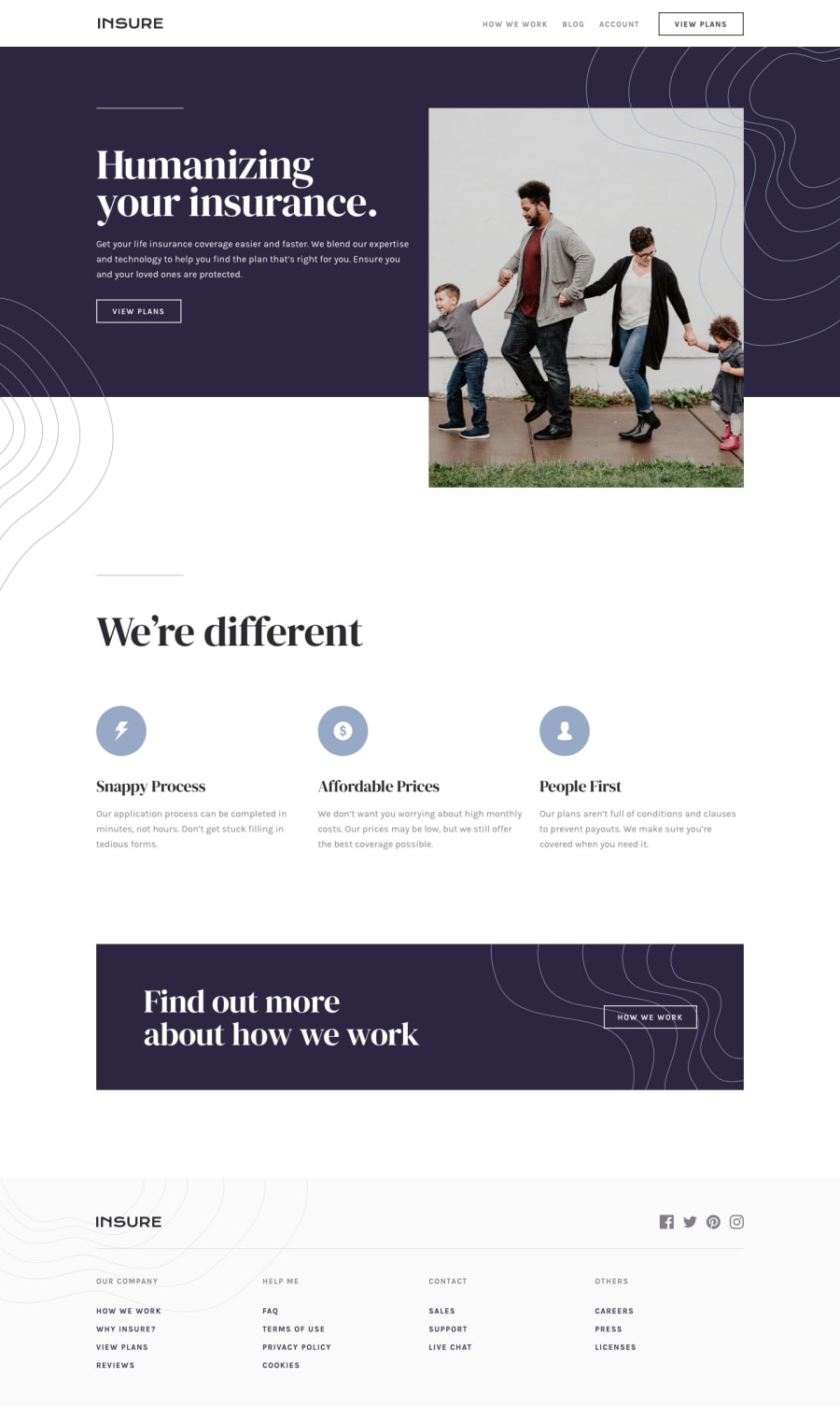
Design comparison
Solution retrospective
I started by creating divs and adding elements within them. I assigned classes to each div and moved onto the CSS. I imported the required fonts, started by removing some default browser styles, and began styling the header. I used my prior knowledge, split up the header into two sides, and used the appropriate flexbox properties to get the design I wanted. Next, I moved onto the title section, where I styled the heading, text and spent some time figuring out the design for the button and hr. I got the image to the size I wanted, and got it positioned to fit the section properly. Then, I moved onto the section2, where I once again used prior knowledge to get the right layout. I used properties like align self, flex direction, and more to get the cards spaced out. Now, I started to design the find out more section, where I used properties like margin and padding to get the right spacing between the text and the buttons. Then, I created the footer where I split up sections of links, added a top part with the logo and social media logos, and styled the links and headings. Lastly, I spent some time working on hover effects and added some media queries to contiune my progress towards learning responsive layouts and web design. Before deploying my website, I checked out the functionality and design on multiple browsers, and used the built-in device emulation feature to see how it would look on different screen sizes. My next steps would be to further improve my background positioning, and responsive design skills.
Community feedback
Please log in to post a comment
Log in with GitHubJoin our Discord community
Join thousands of Frontend Mentor community members taking the challenges, sharing resources, helping each other, and chatting about all things front-end!
Join our Discord
