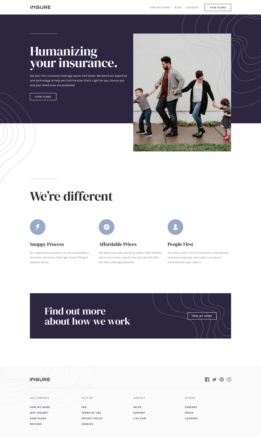
Design comparison
Solution retrospective
Hi all! 👋🏼
It's been a while since I submitted a challenge, but here goes the next one! This one was another great project to practice layouts. I learned a couple of new things, like the <picture> tag and <srcset> to switch images based on screen sizes. I started the project with the mobile-first approach and I have to say it felt more natural going from mobile to desktop, although that depends on the project. I tried using BEM, but midway through the project I started using my own style, so I'll have to be more consistent on that end. In any case, a good project to practice CSS.
Feel free to check it out and comment on anything that can be improved!
Community feedback
Please log in to post a comment
Log in with GitHubJoin our Discord community
Join thousands of Frontend Mentor community members taking the challenges, sharing resources, helping each other, and chatting about all things front-end!
Join our Discord

