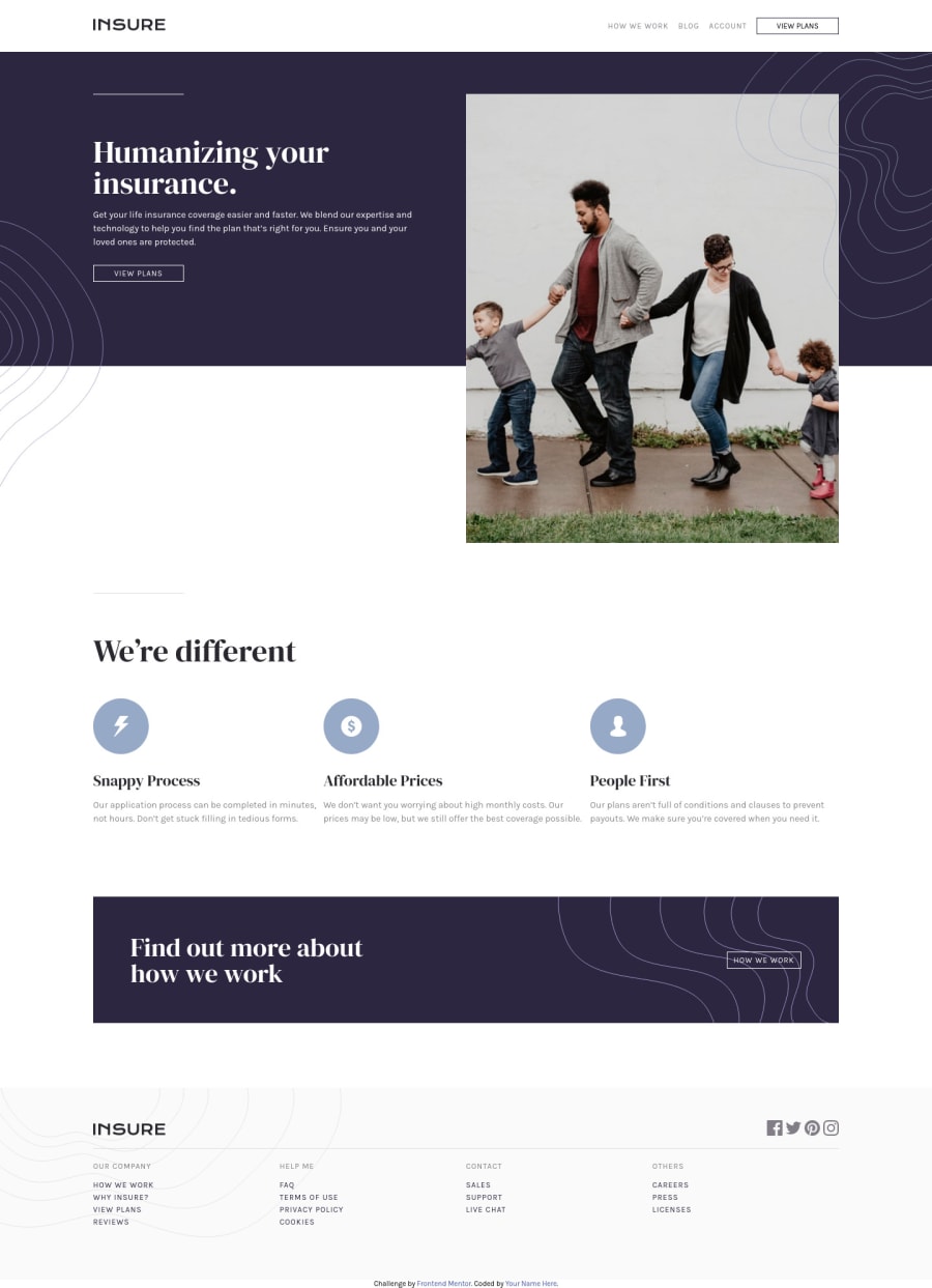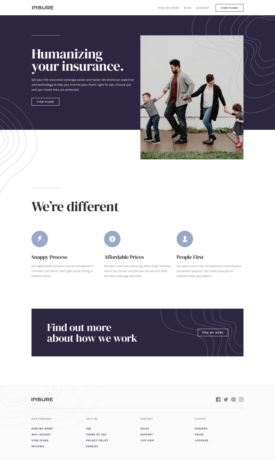
Design comparison
SolutionDesign
Solution retrospective
This took a few tries, I'm still pretty amateur at BEM and I'm not sure I'll keep using that methodology. Please let me know any glaring issues.
Community feedback
- @ApplePieGiraffePosted over 3 years ago
Hi there, A Reynolds! 👋
Good work on this challenge! 👍
A few things I suggest are,
- Adding a hover state to the various interactive elements (such as the buttons and navigation links) on the page.
- Turning the navigation links in the footer of the page into actual links by wrapping them in anchor tags (and doing the same for the social media icons in the footer, too).
- Looking into making your HTML more semantic (which is good for things like SEO and accessibility). You can read about that here and start by using some
<section>tags for the various sections in your site (instead of regular<div>s).
Keep coding (and happy coding, too)! 😁
1@itsagiftPosted over 3 years ago@ApplePieGiraffe Thank you so much for the advice!
0
Please log in to post a comment
Log in with GitHubJoin our Discord community
Join thousands of Frontend Mentor community members taking the challenges, sharing resources, helping each other, and chatting about all things front-end!
Join our Discord
