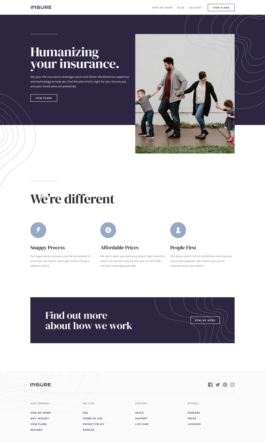
Design comparison
SolutionDesign
Community feedback
- @Kamasah-DicksonPosted over 2 years ago
The only thing I would say is Heading levels should only increase by one level don't mix them up, this helps to improve accessibility.
Besides your solutions looks great on mobile good job👍
0
Please log in to post a comment
Log in with GitHubJoin our Discord community
Join thousands of Frontend Mentor community members taking the challenges, sharing resources, helping each other, and chatting about all things front-end!
Join our Discord
